Browsing Category

Creative Process

Space Refresh: Entrance Way Reveal in Partnership with Mobilia Canada | A Bohemian, Mid-Century Modern Apartment Entrance Way | Justine Celina Maguire’s Home | 2019 Home Decor Trends | Behr Ultra Pure White | Mobilia Aly Velji Modern India Collection Review | Bohemian, Mid Century Modern Decor | Faux Bird of Paradise Plant | Calgary Lifestyle, Interior Design and Home Decor Blogger // JustineCelina.com
Create, Creative Process, DIY, Dwell, Entrance Way, Plants, Space Refresh

SPACE REFRESH | ENTRANCE WAY REVEAL


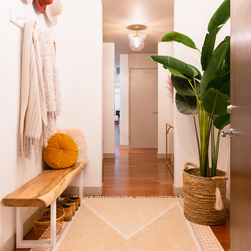
Welcome back for the next highly anticipated reveal in our SPACE REFRESH series, friends! This project has been a year in the making — and today, in partnership with Mobilia Canada, I’m elated to bring you our refreshed Entrance Way! By far, this has been the most challenging room in our SPACE REFRESH series to date. Although it’s responsible for the first impression upon opening the door to our home, it was anything but welcoming before we embarked on this journey back in November of 2018. In stark contrast to the expansive, airy, natural-light-filled rooms you’re used to seeing on these pages, our Entrance Way was exactly the opposite — dark and choppy with just a speck of natural light (just wait until you see the BEFORE photos!). In fact, when we first viewed this apartment before purchasing it 7 years ago, I nearly turned around and walked out — but I’m so glad I didn’t!

You see, all those bright, south-facing, beautifully lit living areas, bedrooms and offices were just past the dimly lit Entrance Way, down a couple of long hallways — which is typical of apartment floor plans. Despite its shortcomings, I was determined we could achieve the welcoming first impression I’d always dreamt of by transforming this space into a bright, welcoming, functional room that felt cohesive with the rest of the apartment. Our Space Refresh | Entrance Way Reveal is a complete overhaul — from a fresh coat of paint, to new light fixtures, to gorgeous new furniture (generously provided by Mobilia), to decor and even a few DIYs! If you have an awkward, uninspiring room in your home in desperate need of a makeover and are searching for some fresh ideas, you’ve come to the right place! Today I’m detailing the entire design process from mood boarding to paint and furniture selection, sprinkled with all my best small-space, storage maximizing tips. So although you may already be familiar with our home, I’d like to formally welcome to our bohemian-meets-mid-century, inner city apartment — may I take your coat?

Continue Reading

How to Transition Your Decor Into Fall | Easy and inexpensive fall decorating ideas | JustineCelina’s Inner City Calgary bohemian, mid-century modern apartment | A Bohemian, Mid-Century Modern Living Room featuring Urban Outfitters Round Pintuck Pillow in Mustard | Fall Decor 2019 Trends | Bohemian, Mid Century Modern Fall Decor | Pantone Fall Winter 2019 / 2020 Interior Design Trends | Fall Decorating DIY | Calgary Lifestyle, Interior Design and Home Decor Blogger // JustineCelina.com
Creative Process, Dwell, Fall, Living Room, Pantone, Plants

HOW TO TRANSITION YOUR DECOR INTO FALL


Autumn is in full swing here in Calgary — have you started to transition your decor along with the seasons? If you’re anything like me, as you transition your wardrobe into fall to reflect our changing landscape and cooler temperatures, you also crave that same change in your home. Although I think it’s important to keep things fresh and be inspired by your environment (especially as a creative or someone who works from home), it’s certainly not practical to be shopping for entirely new decor with every season change! Today’s post is dedicated to simple, inexpensive ideas you can implement in your own home to Transition Your Decor Into Fall — all while drawing inspiration from fresh sources and making use of what you already own. 

I started slowly collecting inspiration for our Fall Living Room Update and bringing autumn into our home in mid September. The weather had started to shift and the trees had started to yellow — and I was in full on fall planning mode (I even created a Pinterest board!). But the timing I had in mind didn’t work out as planned — I had to park the Living Room update to finish up our Entrance Way (this next instalment in our SPACE REFRESH series is now live!) — and this is where we’ve ended up. But rather than waiting to publish our Fall Living Room Update in one big reveal, I’ve decided to share our decor in transition to show you that you don’t have to make drastic changes (or spend a lot!) to make a big impact. If you’re searching for some cozy, autumnal decor inspiration this weekend, fix yourself a chai latte (or perhaps a glass of scotch?) and come curl up in my Living Room for all my best transitional decorating tips! 

Continue Reading

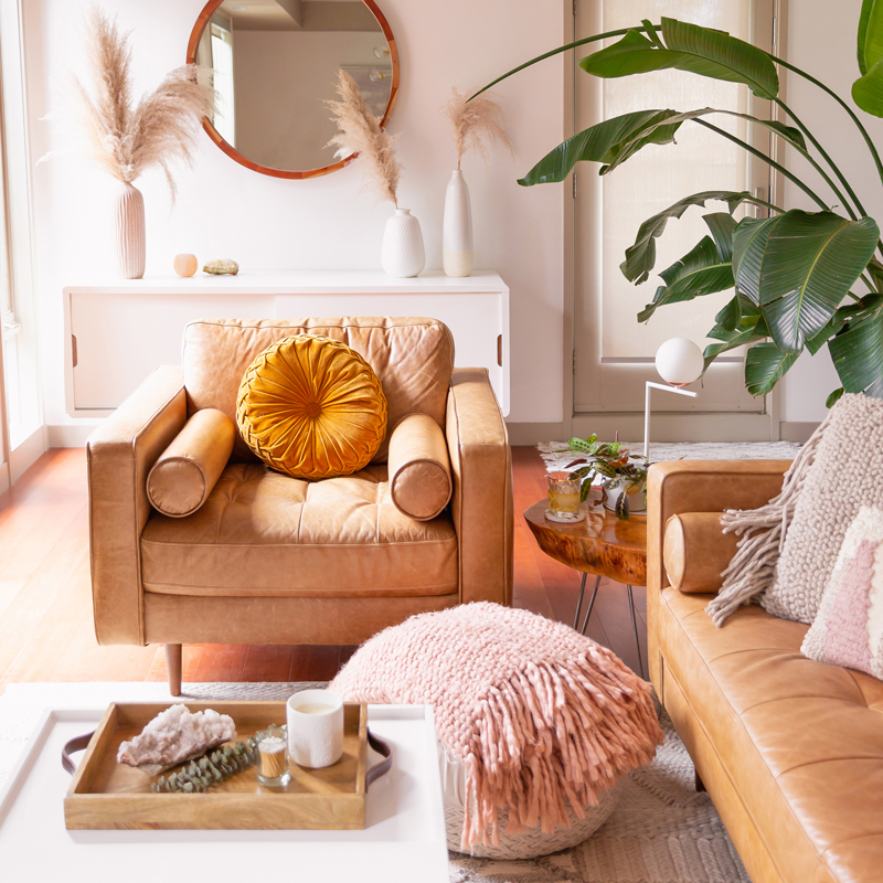
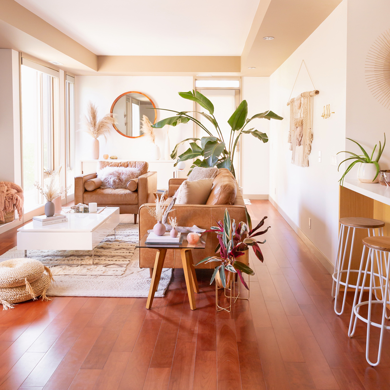
MidSummer Space Refresh Update | A Bohemian, Mid-Century Modern Living Room featuring Pampas Grass and a Mature Bird of Paradise Plant | Summer Decor 2019 Trends | Bohemian, Mid Century Modern Decor | Mature Bird of Paradise Plant | Calgary Lifestyle, Interior Design and Home Decor Blogger // JustineCelina.com
Bathroom, Create, Creative Process, Dining Room, DIY, Dwell, Goals, Kitchen, Life, Living Room, Plants, Space Refresh

MIDSUMMER SPACE REFRESH UPDATE


Interior design loving friends, welcome back for a long overdue SPACE REFRESH update! If you read my 2018 Review + 2019 Goals post, you’ll know that I had planned to have the next rooms in the series completed by now — but due to some unforeseen delays and unexpected (but necessary!) repairs, things have been pushed back. I realized last week that I’ve been pretty good about updating you about what’s going on on my socials, but the majority of you don’t follow me there, so I wanted to publish an all-encompassing Midsummer Space Refresh Update here at JustineCelina to bring you up to speed!

Overall, even though the next rooms in our  have taken longer than expected due to some furniture delays, I’m very happy with the way things are coming together. Originally I was planning to have both the Entrance Way and Main Bathroom complete by the end of Q2, but due to a couple of furniture items being back ordered until the end of September, I’m now planning to have both of those spaces finished this fall. Instead, I’ve used the extra time to source finishing details to really elevate both rooms and make them super functional! It’s actually been a welcome change of pace to take things a bit slower around here, enjoy the summer, and not be working on the apartment every single weekend. If you’re interested in what’s coming next, updates and repairs we’ve made to the other rooms and plans for the rest of the year, fix yourself a cocktail and come join me in my Living Room for a transparent read!

Continue Reading

Another Trip Around The Sun | Brunette woman in a field of canola wearing a button-front ombre maxi dress at sunset celebrating her birthday | Bohemian Summer Outfit Ideas | Leo Season | Calgary, Alberta, Canada Lifestyle and Fashion Blogger, Justine Celina Maguire | JustineCelina Birthday | JustineCelina.com
Business, Creative Process, Goals, Inspiration, Life, Occasions, Summer, Wellness

ANOTHER TRIP AROUND THE SUN


It’s Leo season and the canola is in full bloom here on the Alberta prairies as I celebrate Another Trip Around The Sun. I’ve always associated these free-spirited country flowers with my birthday — so when we stumbled on this gorgeous crop outside Okotoks after wrapping up shoots for my upcoming Late Summer 2019 Lookbook, we pulled over to capture these images as the sun set. It had been a long, hot day and I was a bit sweaty and disheveled, but we had about 15 minutes to make it happen and decided to go for it! To maximize the beautiful golden light, we ended up shooting into the sun (rather than the pretty backlit effect I typically prefer) and I was stunned at how beautifully these images came out — in fact, I think they’re my favourite of all the canola photos we’ve taken over the years. So, I thought it was fitting to share them with you to celebrate my birthday!

I actually wasn’t planning to write a post for my birthday this year — this post, like these photos, were completely spontaneous. This summer I’ve been trying to live in the moment, make the most of my opportunities and take life as it comes — and I feel that this set of images represent me and the direction I’m heading with JustineCelina perfectly right now! I’m happy, healthy and excited about what’s on the horizon — I feel very much in alignment with who I am and ready to for wherever my next trip around the sun takes me. If you’re in the mood for a reflective and uplifting read I’d love for you to pour yourself a glass of wine and spend part of your evening with me! 

Continue Reading

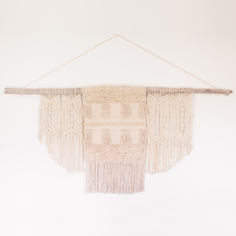
DIY | Modern Driftwood Macrame Wall Hanging | How to Make a Large Macrame Wall Hanging for Less Than $70! | Macrame Wall Hanging Tutorial | Affordable Bohemian Wall Hanging DIY // JustineCelina.com
Create, Creative Process, DIY, Dwell, Travel

DIY | MODERN DRIFTWOOD MACRAME WALL HANGING


I’m riding that just-back-from-vacation-and-feeling-so-inspired wave and coming at you today with a fresh, completely impromptu DIY post! During our recent getaway, our Kootenay cabin was perched on the most beautiful beach with troves of driftwood washed up on shore — and I finally found the perfect piece to complete the large macrame wall hanging I’ve been planning since winter! Immediately after arriving home on Saturday, I got to work on this Modern Driftwood Macrame Wall Hanging, modelling it after the original I created for our refreshed Living Room (which has become one of my most popular DIYs!). Since I was enjoying a little staycation last weekend (I didn’t open my computer or socials for one whole week and it was just what I needed!) I wasn’t actually planning to share this post here at JustineCelina, but after snapping a few process photos over on Insta Stories I was flooded with DMs and questions about how exactly I made it. And here we are!

You may be surprised to learn this oversized macrame wall hanging is actually quite a simple and inexpensive project. The materials to create this 7′ x 3.5′ modern wall hanging cost a whopping $66 and it took me a few hours from start to finish, including installation. If you’re curious about how I pulled it off, you’re in luck — this post contains  step-by-step, visual instructions showing you exactly how I made this bohemian beauty! If you’re looking for a fun weekend project to adorn the walls of your home or for a unique gift idea (a friend of mine created one for a baby shower!) pour yourself a cup of coffee, pull up a seat at my Dining Room table and let’s get crafty! 

Continue Reading

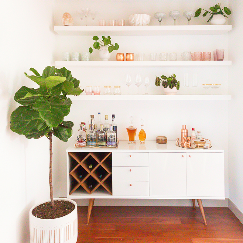
Our Dining Room Bar | A Built-In Look on a Budget | How I created our home bar for less that $1000 | Wayfair All Modern Lemington Wine Rack Sideboard Buffet Table Review | IKEA Lack Shelves to Create a Built in Bar // JustineCelina.com
Bar, Creative Process, Dining Room, DIY, Dwell, Entertain, Plants, Space Refresh, Wine & Cocktails

OUR DINING ROOM BAR | A BUILT-IN LOOK ON A BUDGET


Interior design lovers, I’m back today with a highly requested post in our SPACE REFRESH series detailing exactly how I created our built-in-looking Dining Room Bar for less than $900 (please keep in mind this project was completed n 2019), all in! In the initial reveal of our Dining Room, Bar & Kitchen, I touched on our design choices and the process of how the room came together, but today I’m sharing everything that went into bringing our home bar from concept to completion — including inspiration, planning, sketches and mock ups, alternate shelving options, sources (plus how I hunted down the best deals!) and of course, the finished space. If you’re planning to create a beautiful home bar yourself and are up for a healthy dose of DIY, or you simply want a closer look at where all the COCKTAIL magic happens behind the scenes here at JustineCelina, you’ve come to the right place!

Although this project didn’t turn out as I had originally envisioned it due to timeline and budget constraints, we truly couldn’t be happier with it! Throughout this process, I’ve learned that great interior design does absolutely not have to be extravagant to be functional and beautiful. Our goal with this space was to utilize its recessed features to create extra storage for our libations and glassware without losing any square footage in our main living area. We wanted to create an inspiring area to whip up cocktails, serve wine and allow guests to pour themselves a drink without having to come to the kitchen, which can become full easily. Since we love to entertain, creating a relaxed, informal bar area adjacent to the dining room table allows for much better flow in the room — and it also keeps the liquor flowing! Fix yourself a cocktail or pour up a delicious glass of wine and take a seat at our bar to see how this space came together!


IKEA LACK Wall Shelf in White (x3) | Michaelson 64” Wide 3 Drawer Buffet Table (in White Gloss / Maple Cream) | Mid Century Turned Wood Leg Planter | Bensley Antique 6-Light Chandelier (similar, similar, similar) | Acacia Wood Dining Table (similar) | Mid Century Dining Chairs with Wooden Legs (similar) | Macrame Table Runner (similar)

Continue Reading

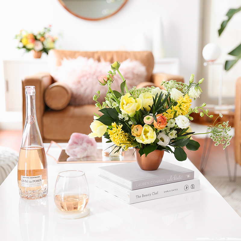
How to Unite a Space With Flowers | A Cheerful Spring Arrangement featuring Hyacinths, Double tulips, Ranunculus, Larkspur, Queen Anne’s Lace, Quicksand roses, Lisianthus, Camellia, Willow Eucalyptus and Podocarpus created by Rebecca Dawn Design // JustineCelina.com
Creative Process, Dwell, Flower Education, Flowers, Living Room, Pantone, Plants, Spring

HOW TO UNITE A ROOM WITH FLOWERS


Flower children, I’m back tonight with a fresh post in our FLOWER EDUCATION series! It’s been a little while since I’ve published a dedicated flower education post — and I thought it was time to switch things up a bit! This post is a hybrid, merging FLOWER and DWELL categories — I’m sharing tips and tricks on How To Unite a Room With Flowers, in addition to the inspiration and details behind the stunning sister arrangements Rebecca Dawn Design created for our Living Room Reveal! I’ve always said that flowers are my not so secret weapon to elevate any celebration or space — I absolutely love to have fresh flowers in our home whenever possible. But today I’m sharing exactly how to select flowers that compliment your space and showcasing a variety of blooms and foliage not yet seen here at JustineCelina!

If you’d like to brighten up your space with some cheerful blooms but aren’t sure where to start, you’ve come to the right place! Pour yourself a delicious glass of rosé (hey, it’s hump day and we’ve earned it!) and enjoy a relaxing mid-week read dedicated to creating a cohesive space that feels fresh and inviting. I’m sharing where I source inspiration for flower content as well as flowers in our home, how I select flowers to compliment decor, colour palette and even the plants in a space (our urban jungle is expanding rapidly!). Learn more about how Rebecca worked with Hyacinths, Double Tulips, Ranunculus, Larkspur, Queen Anne’s Lace, Quicksand Roses, Lisianthus, Podocarpus and Camelia to create these complimentary arrangements that perfectly invoked the fleeting beauty of the season. Cheers, friends!

Continue Reading