Browsing Category

Space Refresh

Transitional Summer Meets Autumn Decor | Summer to Fall Decor | September Decorations | Sunflower Decor | Easy Fall Decorating Ideas 2020 | Affordable Fall Decor | Simple Fall Decor Ideas | Fall Apartment Decor | JustineCelina’s Inner City Calgary bohemian, mid-century modern Living Room | Summer Meets Autumn Decor | Boho Fall Decor Color Palette | The Best Sources for Affordable Bohemian Decor | Calgary Lifestyle Blogger // JustineCelina.com
Dwell, Fall, Flowers, Inspiration, Living Room, Plants, Space Refresh, Summer

TRANSITIONAL SUMMER MEETS AUTUMN DECOR


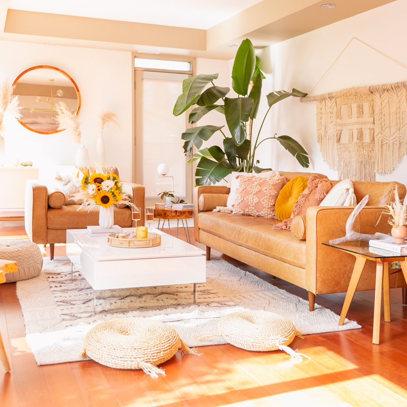
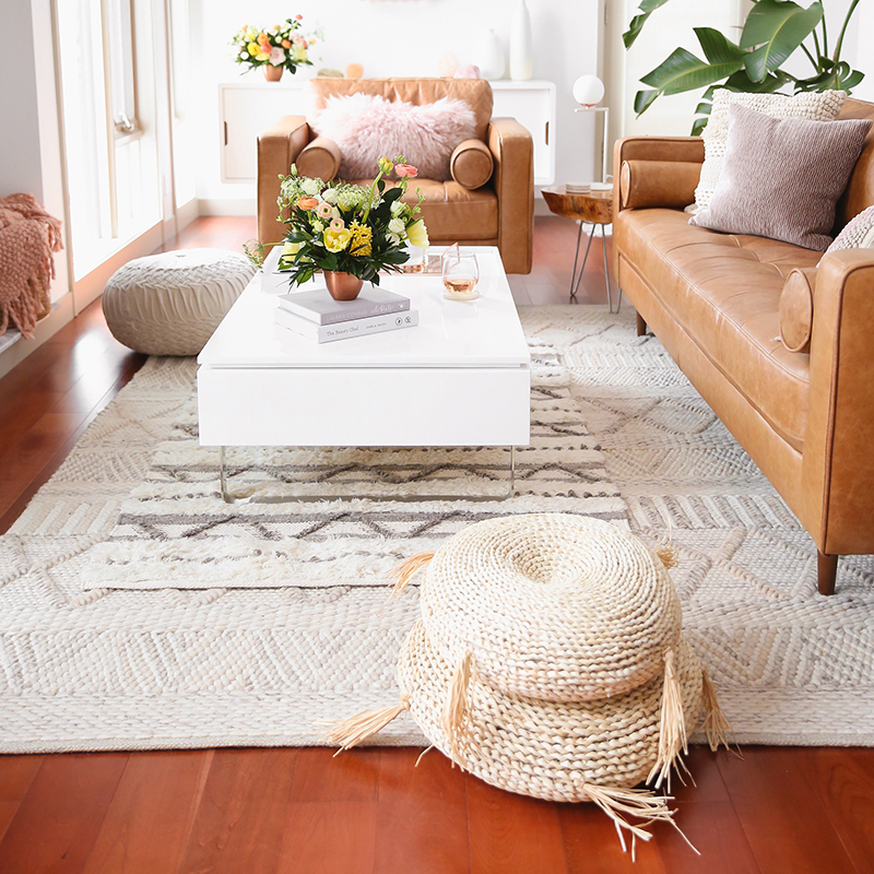
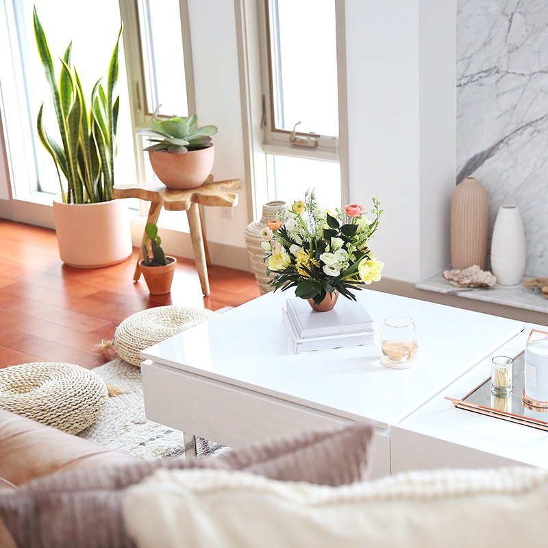
Interior design lovers, I’m thrilled to welcome you back into our sun drenched Living Room for my first dedicated DWELL post of the year! So what exactly have I been up to around here? Well, to be completely transparent, all the brand partnerships I had lined up for our SPACE REFRESH series this year were postponed (some indefinitely) due to COVID. I had so many plans for our remaining rooms, along with updates to spaces you’ve already seen, but due to the current situation, they simply haven’t been possible. Instead, I’ve been focusing on making small tweaks and seasonal updates to already finished spaces so that we can fully enjoy them with all the extra time we’ve spent at home! I’m allowing things to come together naturally, ideas to ebb and flow organically and working away on our home when I feel inspired to do so — because if this pandemic has taught me anything, it’s that life doesn’t always go according to plan. Lately I’ve been cozying things up for autumn, picking up a few new key pieces and restyling items we already own in new ways, so I thought it was about time I share our Transitional Summer Meets Autumn Decor with you here at JustineCelina, if you’re doing the same and looking for inspiration! 

This year we’ve opted to keep things lighter and brighter as we transition into a new season — and it feels like a perfect blend of summer and fall. It’s the magical time of year where we can enjoy the best of both summer and autumn out in nature, in our homes, on our plates and in our wardrobes — and I’m fully embracing it! Despite the pandemic’s challenges, we’ve experienced the warmest autumn I can remember — and I’ve definitely channeled that inspiration into our home this season. I love to experiment with juxtaposition in my personal style and in my home — I’m all about mixing high with low, old with new and modern with traditional. Each year, my inspiration hits an all time high as summer blends into autumn and I explore new ways to translate this seasonal shift into our inner city Calgary apartment! Fall decor doesn’t have to be expensive, overwhelming or impractical — and today I’ve rounded up all my best transitional decorating tips and favourite sources for affordable, quality pieces to refresh your space. If you’re a fellow apartment dweller, working with a small space (or a modest budget!), you’ve come to the right place — pour yourself a glass of crisp rosé and curl up on the sofa as I share our Transitional Summer Meets Autumn Decor

Continue Reading

Space Refresh: Entrance Way Reveal in Partnership with Mobilia Canada | A Bohemian, Mid-Century Modern Apartment Entrance Way | Justine Celina Maguire’s Home | 2019 Home Decor Trends | Behr Ultra Pure White | Mobilia Aly Velji Modern India Collection Review | Bohemian, Mid Century Modern Decor | Faux Bird of Paradise Plant | Calgary Lifestyle, Interior Design and Home Decor Blogger // JustineCelina.com
Create, Creative Process, DIY, Dwell, Entrance Way, Plants, Space Refresh

SPACE REFRESH | ENTRANCE WAY REVEAL


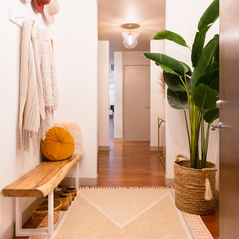
Welcome back for the next highly anticipated reveal in our SPACE REFRESH series, friends! This project has been a year in the making — and today, in partnership with Mobilia Canada, I’m elated to bring you our refreshed Entrance Way! By far, this has been the most challenging room in our SPACE REFRESH series to date. Although it’s responsible for the first impression upon opening the door to our home, it was anything but welcoming before we embarked on this journey back in November of 2018. In stark contrast to the expansive, airy, natural-light-filled rooms you’re used to seeing on these pages, our Entrance Way was exactly the opposite — dark and choppy with just a speck of natural light (just wait until you see the BEFORE photos!). In fact, when we first viewed this apartment before purchasing it 7 years ago, I nearly turned around and walked out — but I’m so glad I didn’t!

You see, all those bright, south-facing, beautifully lit living areas, bedrooms and offices were just past the dimly lit Entrance Way, down a couple of long hallways — which is typical of apartment floor plans. Despite its shortcomings, I was determined we could achieve the welcoming first impression I’d always dreamt of by transforming this space into a bright, welcoming, functional room that felt cohesive with the rest of the apartment. Our Space Refresh | Entrance Way Reveal is a complete overhaul — from a fresh coat of paint, to new light fixtures, to gorgeous new furniture (generously provided by Mobilia), to decor and even a few DIYs! If you have an awkward, uninspiring room in your home in desperate need of a makeover and are searching for some fresh ideas, you’ve come to the right place! Today I’m detailing the entire design process from mood boarding to paint and furniture selection, sprinkled with all my best small-space, storage maximizing tips. So although you may already be familiar with our home, I’d like to formally welcome to our bohemian-meets-mid-century, inner city apartment — may I take your coat?

Continue Reading

MidSummer Space Refresh Update | A Bohemian, Mid-Century Modern Living Room featuring Pampas Grass and a Mature Bird of Paradise Plant | Summer Decor 2019 Trends | Bohemian, Mid Century Modern Decor | Mature Bird of Paradise Plant | Calgary Lifestyle, Interior Design and Home Decor Blogger // JustineCelina.com
Bathroom, Create, Creative Process, Dining Room, DIY, Dwell, Goals, Kitchen, Life, Living Room, Plants, Space Refresh

MIDSUMMER SPACE REFRESH UPDATE


Interior design loving friends, welcome back for a long overdue SPACE REFRESH update! If you read my 2018 Review + 2019 Goals post, you’ll know that I had planned to have the next rooms in the series completed by now — but due to some unforeseen delays and unexpected (but necessary!) repairs, things have been pushed back. I realized last week that I’ve been pretty good about updating you about what’s going on on my socials, but the majority of you don’t follow me there, so I wanted to publish an all-encompassing Midsummer Space Refresh Update here at JustineCelina to bring you up to speed!

Overall, even though the next rooms in our  have taken longer than expected due to some furniture delays, I’m very happy with the way things are coming together. Originally I was planning to have both the Entrance Way and Main Bathroom complete by the end of Q2, but due to a couple of furniture items being back ordered until the end of September, I’m now planning to have both of those spaces finished this fall. Instead, I’ve used the extra time to source finishing details to really elevate both rooms and make them super functional! It’s actually been a welcome change of pace to take things a bit slower around here, enjoy the summer, and not be working on the apartment every single weekend. If you’re interested in what’s coming next, updates and repairs we’ve made to the other rooms and plans for the rest of the year, fix yourself a cocktail and come join me in my Living Room for a transparent read!

Continue Reading

Our Dining Room Bar | A Built-In Look on a Budget | How I created our home bar for less that $1000 | Wayfair All Modern Lemington Wine Rack Sideboard Buffet Table Review | IKEA Lack Shelves to Create a Built in Bar // JustineCelina.com
Bar, Creative Process, Dining Room, DIY, Dwell, Entertain, Plants, Space Refresh, Wine & Cocktails

OUR DINING ROOM BAR | A BUILT-IN LOOK ON A BUDGET


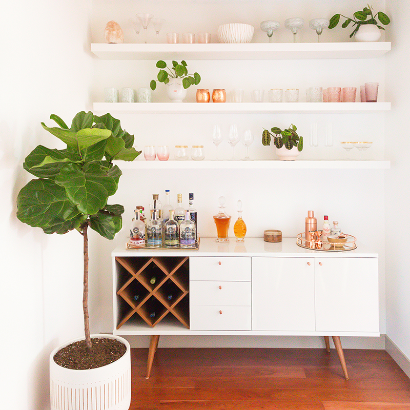
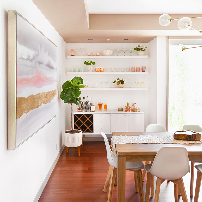
Interior design lovers, I’m back today with a highly requested post in our SPACE REFRESH series detailing exactly how I created our built-in-looking Dining Room Bar for less than $900 (please keep in mind this project was completed n 2019), all in! In the initial reveal of our Dining Room, Bar & Kitchen, I touched on our design choices and the process of how the room came together, but today I’m sharing everything that went into bringing our home bar from concept to completion — including inspiration, planning, sketches and mock ups, alternate shelving options, sources (plus how I hunted down the best deals!) and of course, the finished space. If you’re planning to create a beautiful home bar yourself and are up for a healthy dose of DIY, or you simply want a closer look at where all the COCKTAIL magic happens behind the scenes here at JustineCelina, you’ve come to the right place!

Although this project didn’t turn out as I had originally envisioned it due to timeline and budget constraints, we truly couldn’t be happier with it! Throughout this process, I’ve learned that great interior design does absolutely not have to be extravagant to be functional and beautiful. Our goal with this space was to utilize its recessed features to create extra storage for our libations and glassware without losing any square footage in our main living area. We wanted to create an inspiring area to whip up cocktails, serve wine and allow guests to pour themselves a drink without having to come to the kitchen, which can become full easily. Since we love to entertain, creating a relaxed, informal bar area adjacent to the dining room table allows for much better flow in the room — and it also keeps the liquor flowing! Fix yourself a cocktail or pour up a delicious glass of wine and take a seat at our bar to see how this space came together!


IKEA LACK Wall Shelf in White (x3) | Michaelson 64” Wide 3 Drawer Buffet Table (in White Gloss / Maple Cream) | Mid Century Turned Wood Leg Planter | Bensley Antique 6-Light Chandelier (similar, similar, similar) | Acacia Wood Dining Table (similar) | Mid Century Dining Chairs with Wooden Legs (similar) | Macrame Table Runner (similar)

Continue Reading

Dining Room / Bar / Kitchen Reveal in Partnership with HomeSense Canada | A Bohemian, Mid Century Modern Apartment in Calgary, Alberta, Canada // JustineCelina.com
Bar, Create, Creative Process, Dining Room, DIY, Dwell, Entertain, Flowers, Goals, Kitchen, Life, Plants, Space Refresh, Sponsored, Wine & Cocktails

SPACE REFRESH | DINING ROOM, BAR & KITCHEN REVEAL


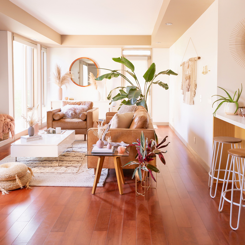
Happy Monday everyone — and welcome back for the next, highly anticipated reveal in our SPACE REFRESH series! Today, in partnership with HomeSense Canada, I’m elated to unveil the other half of our refreshed main living area — the Dining Room, Bar & Kitchen. While we’ve been refreshing our space since last summer (when we embarked on our huge Paint Transformation!), most of our time was spent gathering inspiration for the Living Room, as we almost completely started from scratch furniture and decor wise over there. Our Living Room took the better part of 6 months to pull together — and during my many HomeSense runs as it came to life (a lot of you came along via Insta Stories!), I also had a vision for the adjacent Dining Room, Bar & Kitchen in mind, picking up items for this space as I curated details for our Living Room. So, relatively speaking, this area came together quite quickly in comparison!

Our Living Room, Dining Room, Bar & Kitchen are all located in the same space — a large, long and somewhat narrow room. So, we kept the overall look and feel as cohesive as possible to unify the separate areas of the room with an overarching design sensibility. We took design cues for our SPACE REFRESH from our developer who was inspired by earth’s natural elements — our space features natural materials and textures with a warm, mid century modern vibe, a touch of boho and an abundance of greenery! Not only are we thrilled with the aesthetic appeal of our refreshed Dining Room, Bar & Kitchen, this space is also very functional for the way we live in it, which I consider the true mark of great design. Today I’m sharing all my tips, tricks and inspiration for designating different areas within one large room, creating and maximizing apartment storage, as well cost effective ways to refresh your space while repurposing your existing furniture (our only new piece in this space is our sideboard — the rest has been with us for years!). Pull up a seat at our table and settle in for your evening read, friends — can I fix you a cocktail?

Continue Reading

Our Living Room Furniture + $250 Structube #Giveaway | A Bohemian, Mid Century Modern Apartment in Calgary, Alberta, Canada | Justine Celina Maguire Living Room // JustineCelina.com
Creative Process, Dwell, Giveaways, Living Room, Plants, Space Refresh

OUR LIVING ROOM FURNITURE


Welcome back, interior design lovers — I have a very exciting post for you today! Since publishing our Living Room Reveal (and having it featured and shared across the internet — eee!) I’ve received many questions about our furniture, where we purchased it and how we chose each piece — and I’ve been quietly planning this post behind the scenes! Today I’m thrilled to announce that I’ve teamed up with Structube (where we purchased the majority of our Living Room furniture) to answer all your FAQs and giveaway a $250 Gift Card to one of my Canadian readers! How amazing is that? I know $250 certainly would have put a sizeable dent in a piece of furniture for our Living Room (I’m a bit jealous, TBH!). I’m so grateful for your support on our SPACE REFRESH series and knew I wanted to thank you by giving back — and Structube very generously offered to make that possible!

Today I’m revealing all the sources for the furniture we chose to refresh our Living Room — along with my process for creating our mood board, how we moved through the design process and how our final furniture selections deviated from the original plan (oh, the art of compromise when you’re designing a space with your partner!). I’m also sharing my best tips for maximizing an apartment sized living room and creating an inviting, functional, relatively clutter free space. If you’re a lover of mid century modern design and natural materials, you’ll love today’s post! Pour yourself a nice, crisp glass of wine (I’m actually enjoying a glass of the Côte des Roses you’ll see on our EVO Coffee Table in these photos) and settle in for your weekend read — and head to the bottom of the post for details on how to enter my $250 Structube Gift Card Giveaway (now closed)!

Continue Reading

JustineCelina Living Room Featured on Apartment Therapy // JustineCelina.com
Dwell, Flowers, Goals, Guest Posts & Features, Inspiration, Living Room, Plants, Space Refresh

OUR APARTMENT THERAPY LIVING ROOM FEATURE


I interrupt regularly scheduled programming to share the most exciting news, friends — our Living Room was featured on Apartment Therapy yesterday! To say I’m absolutely ecstatic to have our home featured on Apartment Therapy is a huge understatement. It was a dream of mine to be featured at Apartment Therapy years ago when our SPACE REFRESH was just an idea (and bit of a fantasy!). I had always envisioned the blog taking more of a home decor and interior design focus, but it’s been a long road to get there — and now, here we are! I’ve spent countless hours pouring over the gorgeous homes and endless inspiration Apartment Therapy provides since my art college days — and it’s completely surreal to now be featured among them and be recognized by such an iconic publication. I don’t typically publish blog posts dedicated to features (although I do I let you know about them on my socials and you can always catch them on my PRESS page), however, this one deserves an exception. I submitted our Living Room for consideration last month — knowing it was a long shot since we’re a) Canadian (they feature American homes prominently), b) it was just one room (they typically feature entire homes) and c) it was my first submission. To be honest, I’m still in shock!

My sincerest thank you to the team at Apartment Therapy for the beautiful feature and to my longtime partners, HomeSense Canada and Rebecca Dawn Design for embarking on this journey with me as I chase my passions and transition into more HOME based content this year — our space refresh wouldn’t be possible without their trust and support! It was a huge gamble making the transition this year as I had to really scale back on the content I produced in other categories to make our space refresh possible. It’s been an extreme labour of love (including many late nights, early mornings and countless sacrifices) and a challenging process to conjure up brand support, as home based content and interior design projects aren’t something I’d produced previously here at JustineCelina. But friends, this is just the beginning and I promise the best is yet to come! I hope you’re as excited as we are to continue our SPACE REFRESH journey — up next is our Dining Room, Bar & Kitchen (publishing next month in partnership with HomeSense — be sure to tune in to my Insta Stories for a BTS look at how it’s coming together!). In the meantime, you can hop over to ApartmentTherapy.com for the full feature and some exclusive snaps of our Living Room! Also, hello to all you lovely people coming over from the feature — I’m thrilled to have you!

Continue Reading