Interior design lovers, I’m back today with a highly requested post in our SPACE REFRESH series detailing exactly how I created our built-in-looking Dining Room Bar for less than $900 (please keep in mind this project was completed n 2019), all in! In the initial reveal of our Dining Room, Bar & Kitchen, I touched on our design choices and the process of how the room came together, but today I’m sharing everything that went into bringing our home bar from concept to completion — including inspiration, planning, sketches and mock ups, alternate shelving options, sources (plus how I hunted down the best deals!) and of course, the finished space. If you’re planning to create a beautiful home bar yourself and are up for a healthy dose of DIY, or you simply want a closer look at where all the COCKTAIL magic happens behind the scenes here at JustineCelina, you’ve come to the right place!
Although this project didn’t turn out as I had originally envisioned it due to timeline and budget constraints, we truly couldn’t be happier with it! Throughout this process, I’ve learned that great interior design does absolutely not have to be extravagant to be functional and beautiful. Our goal with this space was to utilize its recessed features to create extra storage for our libations and glassware without losing any square footage in our main living area. We wanted to create an inspiring area to whip up cocktails, serve wine and allow guests to pour themselves a drink without having to come to the kitchen, which can become full easily. Since we love to entertain, creating a relaxed, informal bar area adjacent to the dining room table allows for much better flow in the room — and it also keeps the liquor flowing! Fix yourself a cocktail or pour up a delicious glass of wine and take a seat at our bar to see how this space came together!
IKEA LACK Wall Shelf in White (x3) | Michaelson 64” Wide 3 Drawer Buffet Table (in White Gloss / Maple Cream) | Mid Century Turned Wood Leg Planter | Bensley Antique 6-Light Chandelier (similar, similar, similar) | Acacia Wood Dining Table (similar) | Mid Century Dining Chairs with Wooden Legs (similar) | Macrame Table Runner (similar)
OUR DINING ROOM BAR | A BUILT IN LOOK ON A BUDGET
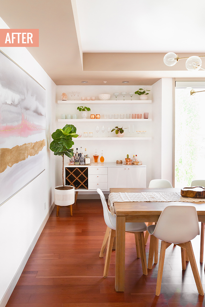
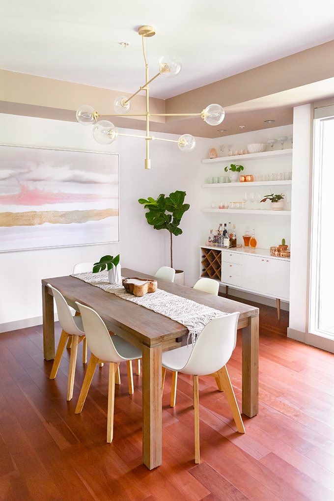
With summer almost behind us, we’ve had a few solid months to enjoy our new bar since having finished it up at the end of May — and I truly couldn’t be more pleased with it! Even though it’s not what I originally envisioned, I actually think it turned out better than my original plan. And with the total project cost ringing in a $829.14, I even managed to complete our Dining Room Bar refresh for less than our $1000 budget. Don’t you just love it when that happens? Today I’m sharing exactly how I pulled it off!
But first, let me bring you up to speed on our SPACE REFRESH project! Around this time last year, we started the process of refreshing our 6 year old apartment and creating our dream home. First up was a fresh coat of paint, followed by a major purge, reorganization and selling old furniture and decor, before starting with a clean slate in the Living Room.
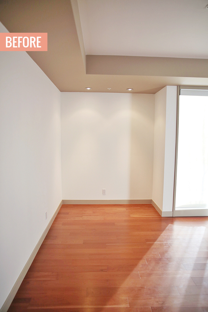
The Dining Room, Living Room and Bar all co-exist in one large, long room. You enter the main living area of our home by walking through a very long hallway — and this view is the first thing you see. Our 4 floor to ceiling windows run along long the south facing wall, where there’s a fireplace built in to the recessed space between them. We also have another another recessed spot along window wall — kind of an awkward little nook that has always been our bar.
While we loved the convenience and accessibility of having our bar run alongside the dining room table, separate from the kitchen, previously it was a space that didn’t really work for us since we have a lot of wine, spirits and glassware and they were all hiding in a bulky, fold up bar. After a major purge (who watched the Stories?!) I was clear on exactly how much storage we needed. My primary goal for our refreshed space was to maximize storage while making use of the depth of the recessed nook, so we essentially didn’t loose any square footage in the Dining Room.
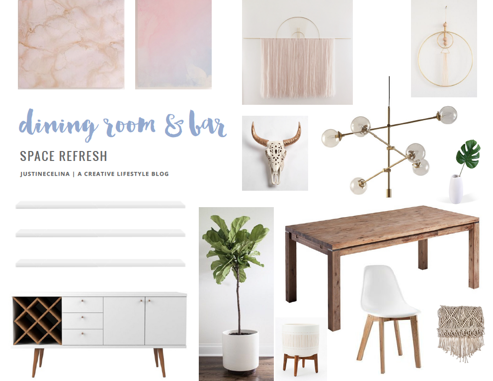
This prominent corner of the room can get quite dark in contrast to the rest of the space, simply because of the way the natural light falls. So, when I was pulling inspiration together for the refresh, I wanted to bring the bright and airy feeling of our Living Room to the bar area and create even more functional storage. I knew I wanted to add shelving above a new sideboard or buffet — but I wasn’t exactly sure how I wanted it to look. So, I started by sourcing elements, then pulling together a rough moodboard and creating mockups!
Planning
Since I worked with HomeSense to bring this space to life initially (although this post isn’t sponsored), I treated it like work — setting deadlines, a budget and a firm timeline. Although we had a few set backs in terms of shipping and delivery and things got a bit stressful, I’m happy to report I completed this project on time and on budget!
We had just over 2 months (from March 19th to May 28th) to complete our Dining Room Bar (along with the Dining Room and Kitchen!), and while the area was painted and ready to go, everything else in the space came together within this time frame. An over-thinker by nature, I found that sticking to a fairly tight (but realistic) timeline forced me to make quick decisions and just get it done, rather than pondering every design choice for way too long — which is very easy to do when designing a space in your own home! I found the process of planning the project and executing on a timeline, just as I would for a client but in my own home, very refreshing. In fact, I’ll be tackling the rest of our SPACE REFRESH series in exactly the same manner!
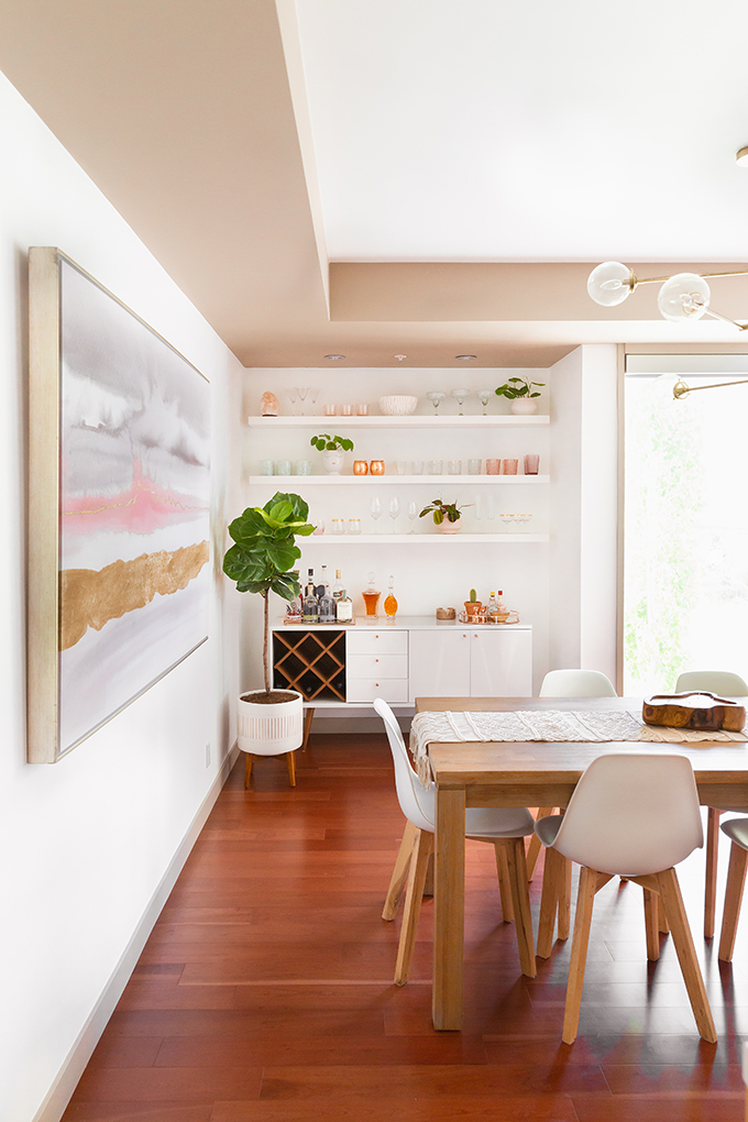
Since we wanted to keep our existing dining room table and chairs, I knew I wanted to juxtapose sleek white, natural wood textures and metallic accents to make everything feel cohesive. The first thing we replaced in the space was actually the chandelier! Since you could see it in the mirror from the Living Room, we hung our new Bensley Antique 6-Light Chandelier before I shot the reveal photos for that space. So, I used all of our existing Dining Room furniture plus the new chandelier to help inform my design choices for our bar nook.
Once I had sourced buffets, sideboards and shelving options that were within the budget (or so I thought — more on that below!), I used a photo of the empty space I shot for our paint transformation to create mockups. This really helped me to envision exactly how the pieces would look in the space and make quick decisions! If you’re designing a space from scratch and aren’t sure where to start, I highly recommend a moodboard, followed by mockups. It made this process so much easier (and more fun!).
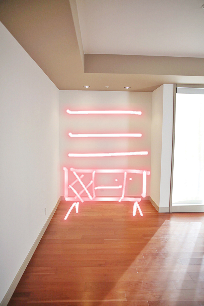
This was actually my first ‘mockup’ — a quick Insta Stories sketch that I shared when I was in the initial planning stage and polling for feedback. So, use whatever works for you! Although it’s rough, you’ll see that it’s actually pretty similar to the finished space. I knew I wanted a sideboard or buffet, preferably with a wine rack (or a space to add our own) with shelving (preferably 3 shelves, dependent on the height of the sideboard) on the wall above.
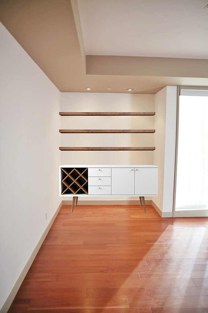
I found the Wade Logan Michaelson 64” Wide 3 Drawer Buffet Table in White Gloss and Maple Cream as I was sourcing pieces for the space — and I was love at first sight. I knew it would be ideal to invest the majority of the budget in the sideboard, as it would get a lot of use and need to be durable to withstand drink pouring, splashes and glassware. It also mimicked the white, high gloss finish of the upper cabinets of our kitchen. I originally spotted it for a whopping $1,029.99 at wayfair.ca and was a bit heartbroken that it wouldn’t work with our budget. So, I pulled a couple of other options, but kept an eye on it, hoping it would go on sale!
This early on in the process I also had my heart set on real wood shelves. I visited a few lumber and wood shops here in Calgary to price out my options — and it seemed doable if I allowed half of the budget for shelving and half for furniture. Although it would have been tight timeline wise, I was confident that we could create something beautiful.
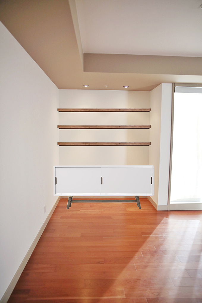
With that in mind, another option I considered was our beloved OCEAN 2 Door Sideboard — which may look familiar because we have one in the Living Room! It’s a bit roomier than the Wade Logan Michaelson 64” Wide 3 Drawer Buffet Table and would have fit the space perfectly, but didn’t have a built in wine rack. Although, the price (it’s still on sale for $499) and overall functionality were ideal!
At this point I started researching brackets for solid wood shelving — and I was absolutely flabbergasted at the prices. Essentially, wood shelves roughly 30″ deep would have needed a $300 bracket to support them! Multiply that by 3 and the budget was nearly blown, not to mention the exorbitant amount of work that required for installation. We decided that real wood shelving just wasn’t realistic for this project and to started to explore alternate shelving options.
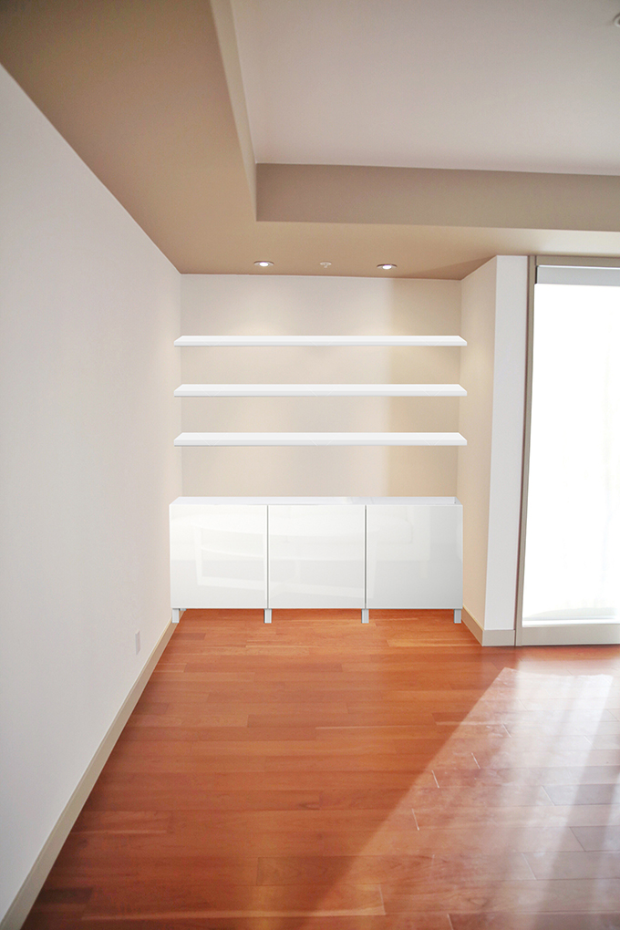
With less than a month left until our deadline, I stumbled on the IKEA BESTÅ Storage Combination with high gloss white doors. It was the least inexpensive options as far as sideboards went at just $350 — but it was also the one I liked the least. It was completely devoid of personality and even if it meant expanding the budget to include wood shelves, I just didn’t like the combination (that, and Adam vehemently despises IKEA!).
But, it also caused me to poke around the IKEA site — where I found the IKEA LACK Wall Shelf in White. At just $29.99 and 74″ wide, they fit the space and the budget perfectly! They also came with brackets and everything you needed to mount them. So, after mocking it up and liking the way they looked, I popped down to IKEA later that day and picked them up. Ringing in at a grand total of $94.47 for all 3 shelves and hardware, I was ecstatic!
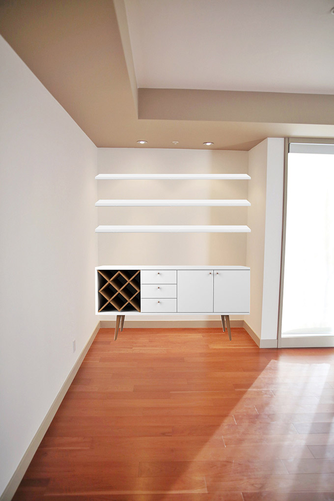
Now that I had the shelving sorted, I needed to make a decision about the sideboard. I loved the look of the Wade Logan Michaelson 64” Wide 3 Drawer Buffet Table in White Gloss and Maple Cream with the LACK Shelves — but it was still out of our budget at wayfair.ca. If you follow along with my FASHION section here at JustineCelina you’ll know that I’m pretty crafty when it comes to stalking down great deals online, so I did some googling to see if our dream sideboard was stocked at any other retailers. It turns out it was — and that it was the least expensive at All Modern. Wayfair, All Modern and a handful of other online retailers are sister sites, so I was a bit confused at the huge (almost $500) price difference. Turns out All Modern was priced in USD but could ship to Canada — and I was also eligible for their Business Program (and therefore a business discount!).
So, that’s exactly what I did! Back in April, the sideboard came to $567.64 USD (with my business discount and a random coupon code I dug up online!) with shipping and duties (which I prepaid at checkout). I was billed $734.67 CDN — which was still considerably less than wayfair.ca’s price, pre-shipping. Although it was a bit of extra leg work, my deal hunting allowed me to complete this project on time and on budget, ringing in at a grand total of $829.14!
Process
Although the shelves were a few inches shy of the width of our bar nook, I was pretty confident they would almost look built-in in the space. While the sideboard in transit, I used the dimensions provided online and I measured out the space meticulously. I knew accurate measurements would be key in creating a professional looking project — so here’s what I came up with.
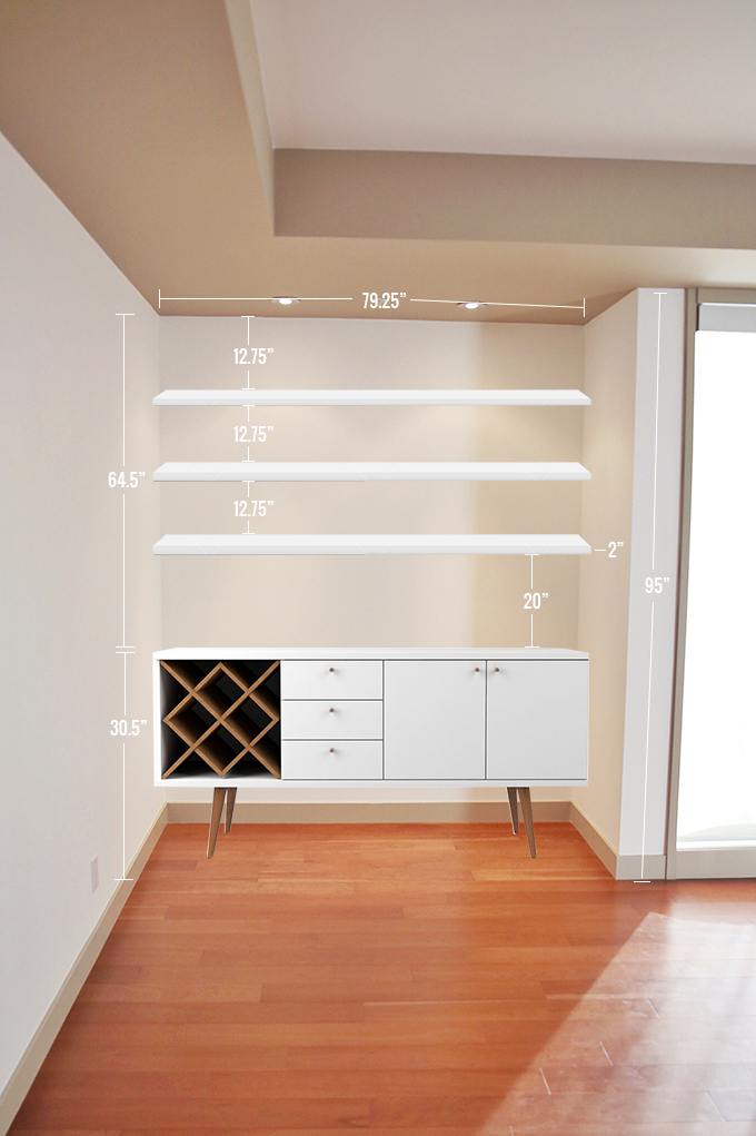
Taking the height of the sideboard into account, I calculated 3 evenly spaced shelves for our bar. I decided to hang the first shelf 20″ above the sideboard to allow for enough space for our bottles and decanters. Since each shelf was 2″ wide, this left us with 12.75″ between each shelf, which was perfect to accommodate our glassware, plants and decor.
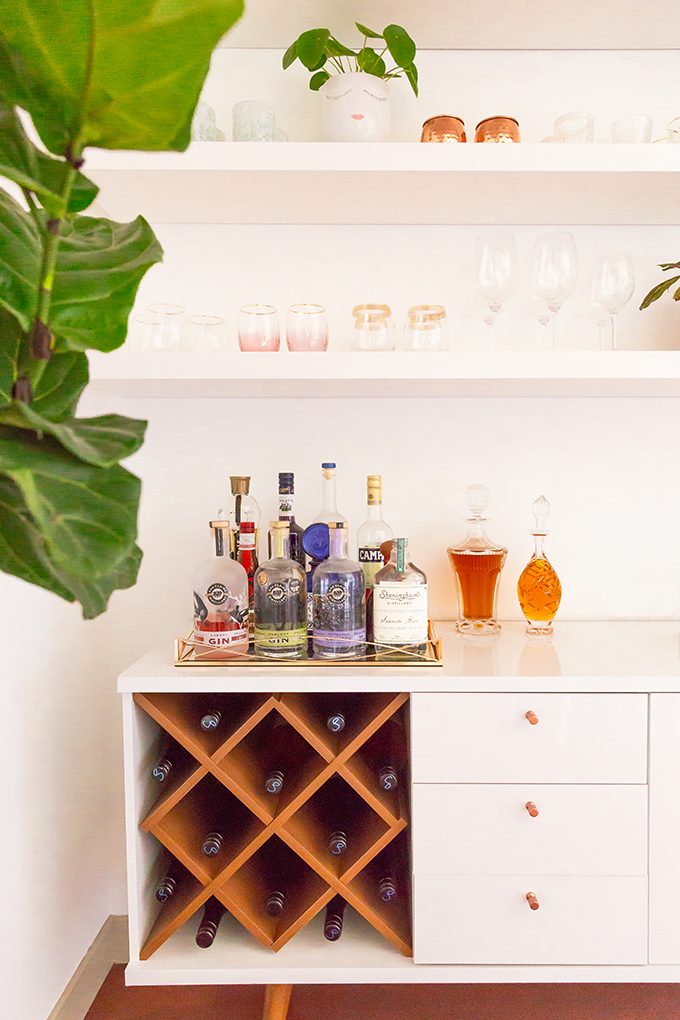
We hung the shelves in one evening. It took a few hours and it was a relatively straightforward process — you can actually still catch in in my Home Highlight on Insta Stories! We started by mapping out the placement of each shelf according to my measurements and using a pencil and tape to mark studs, drill and hang. We hung the shelves a few days before the sideboard arrived and it worked out perfectly, timing wise!
Adam built the sideboard over a weekend — and although we love the look and quality of it, to be completely honest with you, it was an absolute nightmare to put together! Adam is a pretty handy guy, but found the instructions majorly lacking and the pieces not marked clearly. Eventually we figured it out over a few glasses of wine, but it was a struggle! If you’re considering ordering the Michaelson 64” Wide 3 Drawer Buffet Table it’s absolutely stunning and we’re really pleased with the quality, but assembly is a doozy!
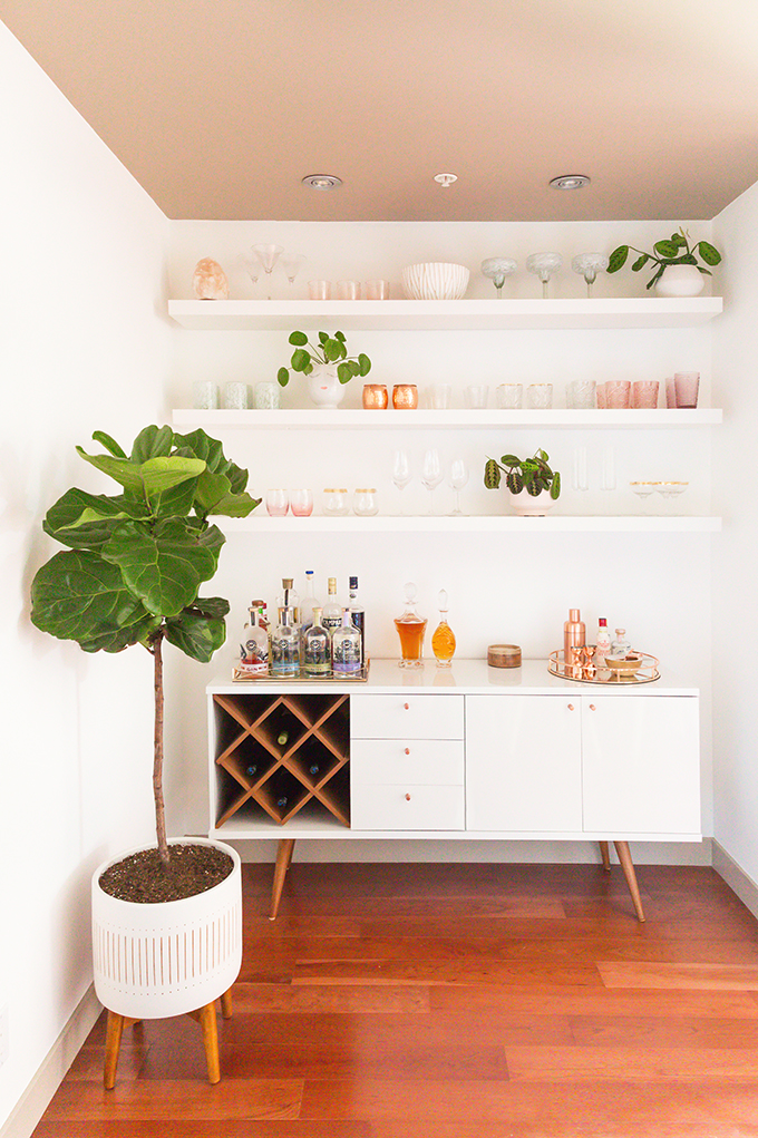
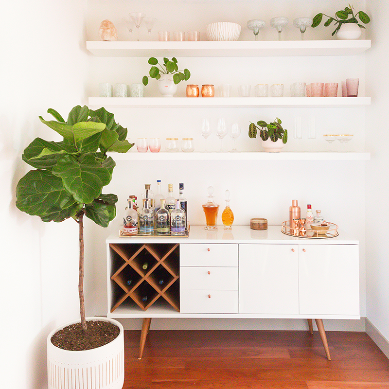
After the sideboard was assembled, I had so much fun styling the shelves and the space for our reveal. We’ve actually kept it exactly the way I originally styled it — plant placement and all! Our plants seem to be loving this refreshed corner as much as we do. It’s been lovely for entertaining, drawing inspiration for my next COCKTAIL (Late Harvest Spiced Apple Sangria, now live!) and I feel like it was always meant to be this way. At a glance it looks completely built-in and cohesive with the rest of our space — we couldn’t be happier!
SHOP THE POST
IKEA LACK Wall Shelf in White (x3) | Michaelson 64” Wide 3 Drawer Buffet Table (in White Gloss / Maple Cream) | Mid Century Turned Wood Leg Planter | Bensley Antique 6-Light Chandelier (similar, similar, similar) | Acacia Wood Dining Table (similar) | Mid Century Dining Chairs with Wooden Legs (similar) | Macrame Table Runner (similar)
MORE FROM OUR DWELL SERIES
Space Refresh | Paint Transformation
Space Refresh | Living Room Reveal
Our Apartment Therapy Living Room Feature
Space Refresh | Dining Room, Bar & Kitchen Reveal
Thanks for coming over for a glass of wine to learn more about our home bar tonight, friends! I hope you found this post helpful and it helps to break the intimidation barrier if you’re thinking of creating a dedicated bar area in your home. After taking the summer off from refreshing our space, I’m excited to bring you some fresh DWELL content this autumn — along with a couple of new reveals and a fall themed home decor post. We’re starting on the second half of our massive Paint Transformation next month and I honestly can’t say I’m looking forward to it, but I am looking forward to the results!
If you’re looking for even more home based inspiration, you can also follow along with my Home Pinterest Board for more interior inspiration, or the JustineCelina Home board where I’ll be pinning our refreshed spaces and other DWELL content as it rolls out.
Disclaimer: Some items featured in this space were provided by HomeSense and Eau Claire Distillery as part of ongoing partnerships. This post is not sponsored and contains my genuine thoughts, ideas and recommendations. JustineCelina uses affiliate and referral links, which allow me to receive a small commission when you make a purchase through one of my links. Thank you for supporting the brands and businesses that support JustineCelina!





20 Comments
Hi!
I have recently gotten into design and was wondering what program you used to place the different furniture pieces so perfectly into your picture? Did you photoshop each item? Please let me know your secret 🙂
Hi there! No big secret — just Photoshop! 😉
[…] it’s taking over your home and you can experiment with what works best in your space! Our Bar features Living Coral hued glassware (which I also use in my recipes) as well as a salt lamp that […]
[…] Our Dining Room Bar | A Built-In Look on a Budget […]
[…] our bottle of Crème de Violette collected dust on our bar for over a year until inspiration struck for a this dramatic, berry-infused, floral kissed sangria. […]
[…] bring a festive touch to the Dining Room and Bar, we added a small tree to our Mid Century Turned Wood Leg Planter, strung fairy lights along the […]
[…] Our Dining Room Bar | A Built-in Look on a Budget […]
[…] with a few other goodies!) to one of my Canadian friends to help lift your spirits and keep your home bars […]
[…] Our Dining Room Bar| A Built-In Look on a Budget […]
[…] In hindsight, I’m also incredibly grateful that we nearly missed our plane home from Huatulco back in January due to our massive mezcal run just prior to takeoff! We took great care in selecting a few premium Oaxacan mezcals to commemorate our trip — one that was recommended by the locals (which I used in this recipe), along with a couple of others that caught our eye. Given the state of the world it doesn’t look like we’ll be able to visit again anytime soon, so we’ve been enjoying many a mezcal cocktail at home this year — and I love having this little taste of Oaxaca right in our home bar! […]
[…] my own, I’m so glad Adam developed a penchant for it and started regularly stocking it in our home bar! If you’re looking to dip your toes into Japanese whisky but aren’t sure where to […]
[…] as repotted our Snake Plant (that used to live infront of the windows) and relocated him to our Bar! Repotting and rearranging your plants can make a huge difference to and room and bring a refreshed […]
[…] Our Dining Room Bar | A Built-In Look on a Budget […]
[…] We slid our then much smaller Bird of Paradise, Barry (learn more about our plants), into the Dining Room and it perched in the back corner in front of our patio door. This year that simply wasn’t an […]
[…] this sparkling NYE cocktail. They were a birthday splurge this past summer when I refreshed our stemware and I can’t recommend them enough. I wanted to link them for you here, as I receive so many […]
[…] Our Dining Room Bar | A Built-In Look on a Budget […]
[…] agave farms and learn about authentic spirits and cocktail making from the locals. In fact, our home bar is always stocked with several varieties of tequila and mezcal from our travels — and I […]
[…] Our Dining Room Bar | A Built-In Look on a Budget […]
[…] shake yourself up a fabulous cocktail in your coziest loungewear, I have just the recipe! From my home bar to yours, I hope this roundup of tested-till-perfect, better-for-you fall cocktail and sangria […]
[…] (Imagen tomada dehttps://justinecelina.com/our-dining-room-bar-built-in-look-on-a-budget/) […]