Happy love day, friends! This year, I’m putting a PANTONE 2019 Colour of the Year spin on Valentine’s celebrations with a warm, pink-hued introduction to all things Living Coral! By now, you’ve likely heard about 2019’s hottest hue — either here at JustineCelina, or elsewhere online. As a creative professional, I’ve followed PANTONE (the global colour authority for creative industries) for inspiration my entire career. In fact, I even have a section dedicated to them here on the blog to categorize all my PANTONE inspired work throughout the years! As someone who’s very inspired by colour, I love to stay informed about the latest colour trends and allow them to inspire, challenge and push my creative work.
As you can probably imagine, I’m particularly passionate about PANTONE’s selection for 2019! If you’re craving a serious dose of colour to help see you through these final wintery months as we (slowly but surely!) transition into spring, today’s post is an ode to Pantone’s 2019 Colour of the Year. Get ready for a mega dose of Living Coral inspiration — including my favourite ideas to inspire you to incorporate this beautifully vibrant and energetic hue into your personal style, home decor, plants, flowers, beauty routine and even your food and drink this year!
AN INTRODUCTION TO PANTONE’S 2019 COLOUR OF THE YEAR | LIVING CORAL
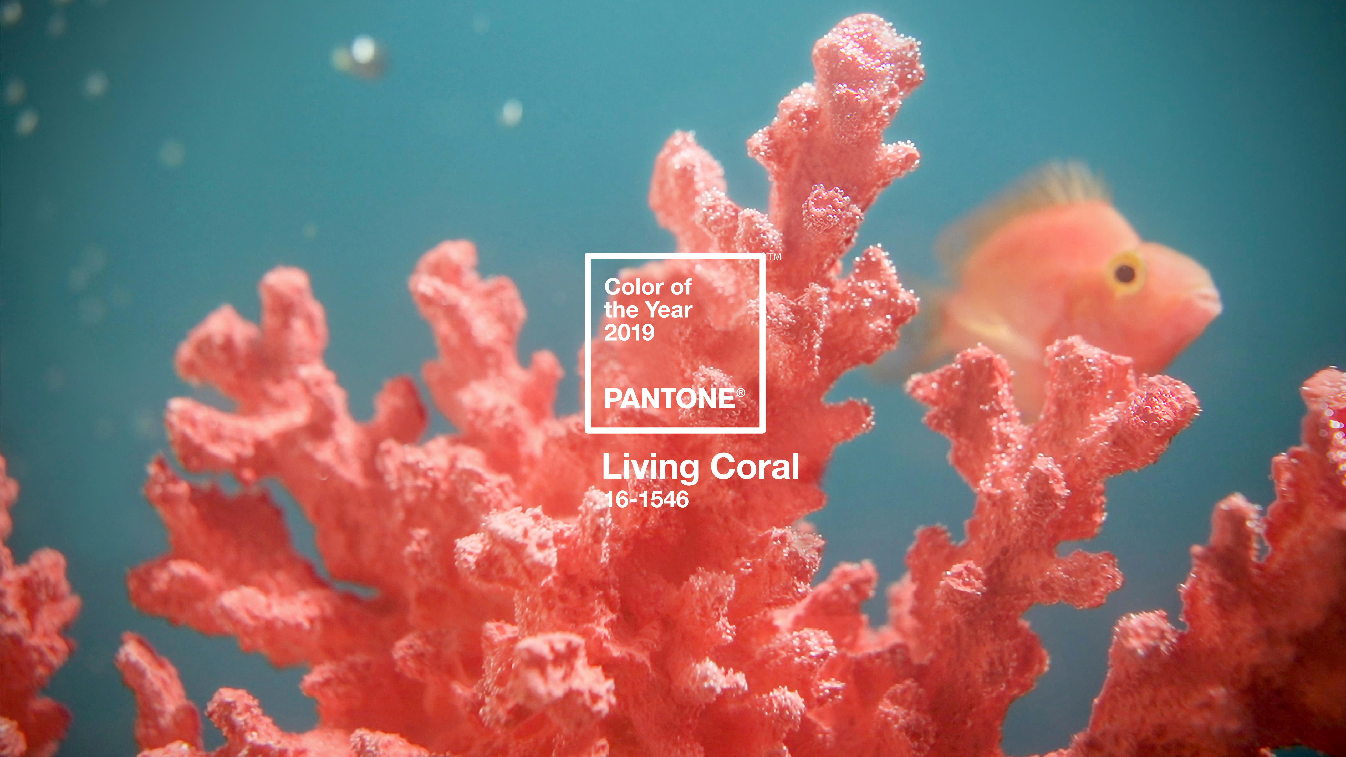
 I find the inspiration behind PANTONE’s Colour of the Year selections incredibly interesting. Living Coral is described as an animating and life-affirming coral hue with a golden undertone that energizes and enlivens with a softer edge. Here’s what inspired 2019’s hottest hue, according to PANTONE’s Executive Director!
“Color is an equalizing lens through which we experience our natural and digital realities and this is particularly true for Living Coral. With consumers craving human interaction and social connection, the humanizing and heartening qualities displayed by the convivial PANTONE Living Coral hit a responsive chord.” ~ Leatrice Eiseman
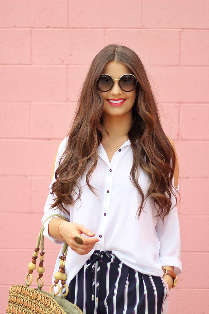
I’ve spoken about this previously, but during a colour theory course during my art college days, we also learned that coral is the most universally flattering shade. Of all the colours in the spectrum, it flatters the largest percentage of skintones! Have you ever wondered why I love to photograph style content against this gorgeous coral-hued wall? Or wear so many coral-toned lipsticks?! Coral makes my warm skintone and green eyes pop!
Coral and blush hues are also an integral part of my personal brand here at JustineCelina. Originally my the colours in my wordmark were inspired by a sunset that mimicked Pantone’s Colour(s) of the Year in 2016, Rose Quartz and Serenity. But you’ll notice a spectrum of warm pinks in the wordmark — one of them being a coral shade, specifically around the ‘n’!

This is one of the reasons why warm toned pinks have continued to trickle into my content over the years. Although I’m very experimental with colour here at JustineCelina and trends come and go, I consider tints and shades warm pink to be cornerstones of my palette. I even painted custom coloured backdrops to mimic the shades in my wordmark that I use when I shoot recipes! Branded colour cohesion is a great practice for any brand to adopt — and definitely something I strive for both in my personal brand as well as in client work.
As you can imagine, I had so much fun pouring over content from years past to pull Living Coral inspiration across categories here at JustineCelina! This posts is categorized into Home Decor, Fashion, Beauty, Plant, Flower and Food & Drink categories, so you can easily navigate to the content that you’re looking for. Let the Living Coral lovefest begin!
LIVING CORAL HOME DECOR INSPIRATION
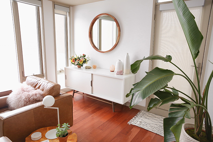
As you’ll see, there are pops of Living Coral sprinkled throughout our decor. One of the most apparent instances is the painting we chose for the Dining Room — which reminds me of an ocean sunset and Adam of the dessert! Either way, I love the playful pop of colour it adds to our space.
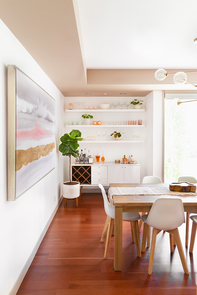
My best piece of advice when it comes to incorporating a trendy colour into your decor is to start slow and focus on accessories that can be easily swapped out. That way, you won’t feel like it’s taking over your home and you can experiment with what works best in your space!
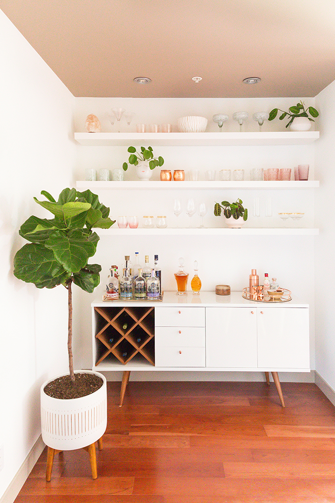
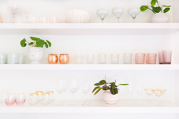 Our Bar features Living Coral hued glassware (which I also use in my recipes) as well as a salt lamp that mimics the shade.
I’ve focused on bringing natural textures and materials into our home (our builder was inspired by earth’s natural elements!), so you’ll find Himalayan pink salt decor scattered throughout our Living Room as well, no matter the season.
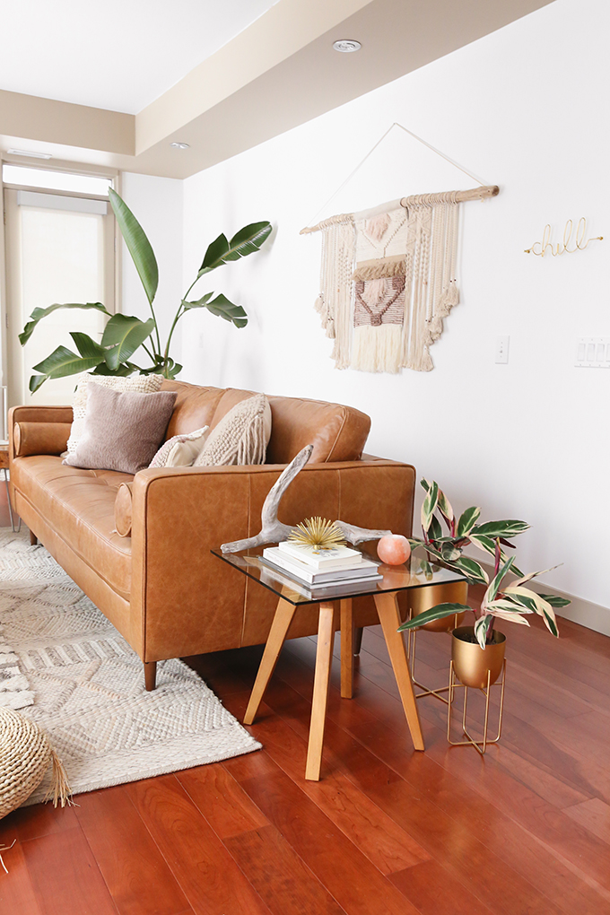 Not only are salt lamps and candle holders aesthetically pleasing, they also offer a host of health benefits, including improved air quality and allergy support.
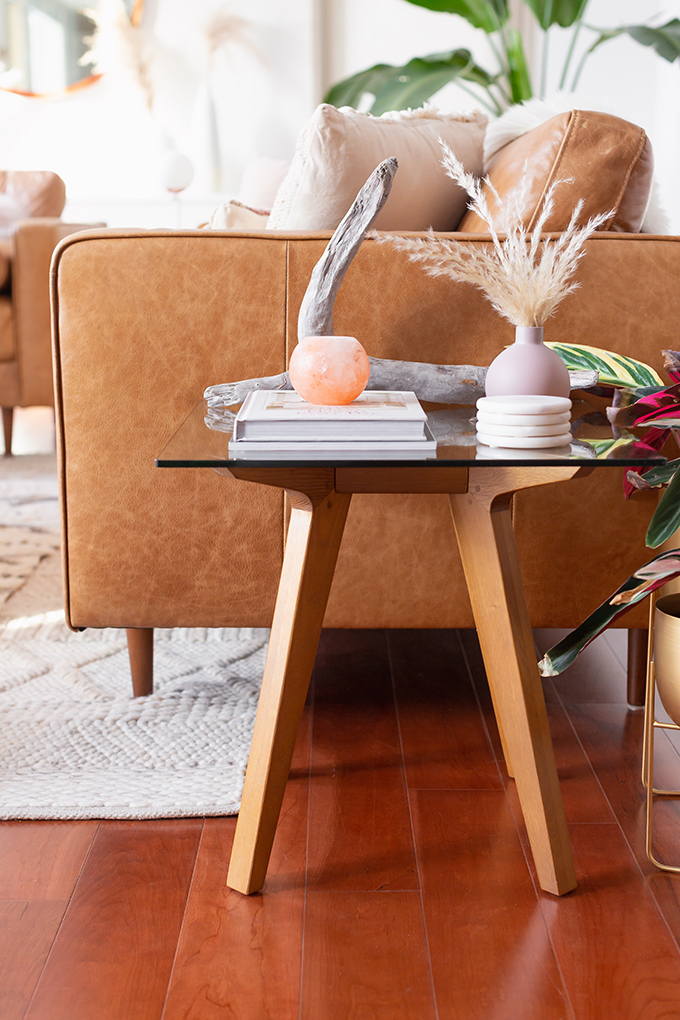 Accessories like candles, vases, throws, pillows are a great place to start incorporating pops of Living Coral into your decor!
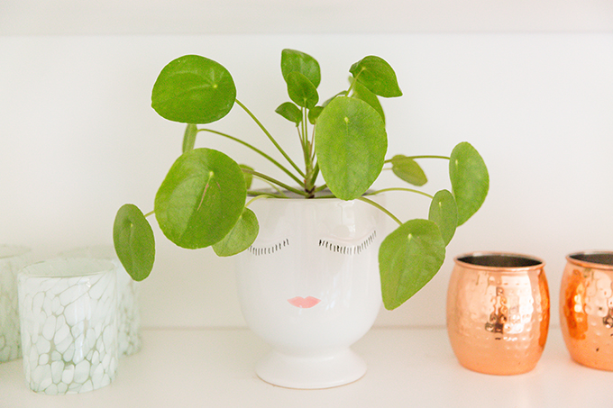
Even the lips on the adorable planter that houses our Japanese Money Plant are a Living Coral hue! I firmly believe great design is achieved by paying attention to the details and making intentional choices to unite a space.
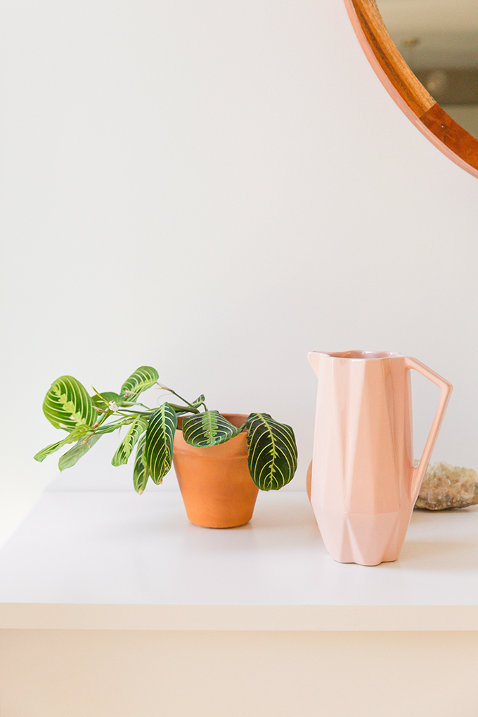
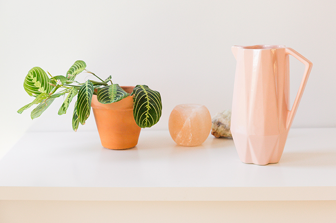
I couldn’t resist this adorable watering jug in a beautiful soft coral shade! If you’ve curious about our houseplants and how I keep our urban jungle healthy, happy and thriving, be sure to check out this post.
LIVING CORAL BEAUTY INSPIRATION
One of my favourite ways to wear coral hues is actually in my makeup! Personally, I’ve always found coral and peach hued lipsticks to be the most flattering on my skintone and they make my green eyes pop.
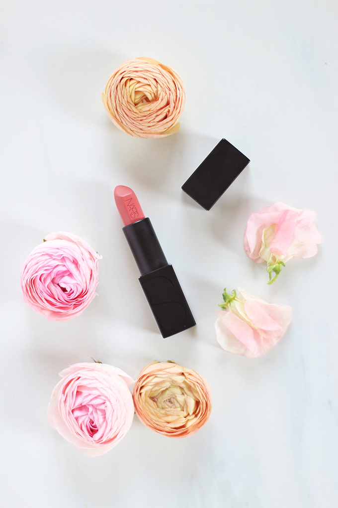 Over my blogging career I’ve amassed quite the collection of BEAUTY products — and today I’m introducing you to my all-time-favourite formulas and shades. The NARS Audacious Lipstick in Brigitte is hands down my favourite lipstick, ever! If I was a lipstick, I would be this lipstick.
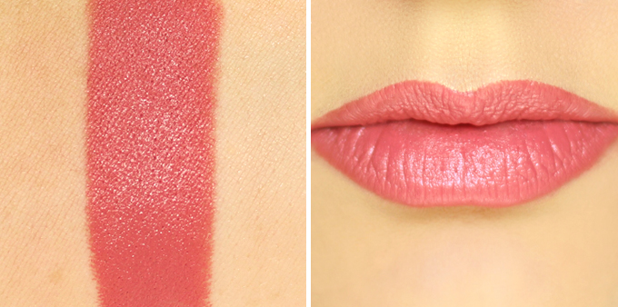
Since discovering it nearly 2 years ago, I’ve gone through 2 tubes! Brigitte will always have a place in my beauty routine — this coral-hued nude gives my complexion life, I can throw it on with anything and the formula is to die for. Plus, the formula is ultra luxurious and hydrating. If you’re looking to dip your toes into the Living Coral trend, this beautiful, classic lipstick in a universally flattering shade is a great place to start! Hop over this post for a full review and click here to see all the different times I’ve worn it over the years.
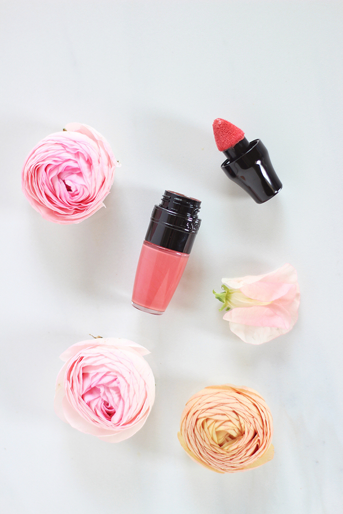
I also discovered the Lancôme Matte Shakers about 2 years ago — and they’ve become a staple in my beauty routine. I currently own 11 shades and they’re pretty much the only lipsticks I continue to purchase these days (I’m actually planning an old-school dedicated review this year!). The formula is really unique — demi matte but lightly hydrating and a dream to apply. I can swipe these one without a mirror and they always look perfect!
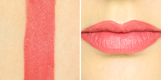
Energy Peach is a dead ringer for Living Coral and one of my personal favourites from the range. It brings such a vibrancy to the complexion while coordinating well with almost everything I may be wearing and it really enhances my eye colour.
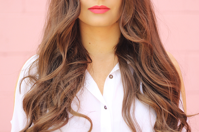
If this formula intrigues you, hop over to this post to learn more about it or check out all the different ways I’ve worn it over the years!
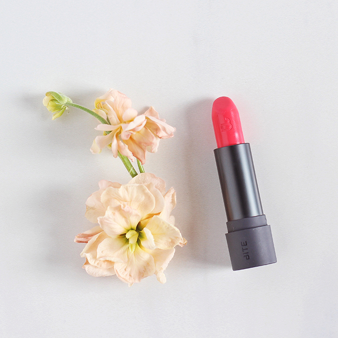
Feeling bold? Bite Beauty Amuse Bouche Lipstick in Pickled Ginger is a fantastic option for those who want to make a statement. It’s a true, bright coral with equal amounts of pink and orange — a truly stunning shade that’s both daring and wearable at the same time.
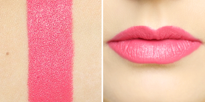
Bite’s Amuse Bouche formula rounds out my trio of all-time-favourite lipstick formulas. It’s made with natural, anti-aging, food grade ingredients — plus, Bite Beauty is a Canadian brand! If you’d like to learn more about Bite Beauty, be sure to reference this post for a comphensive introduction to the brand as well as an in-depth review of this formula.
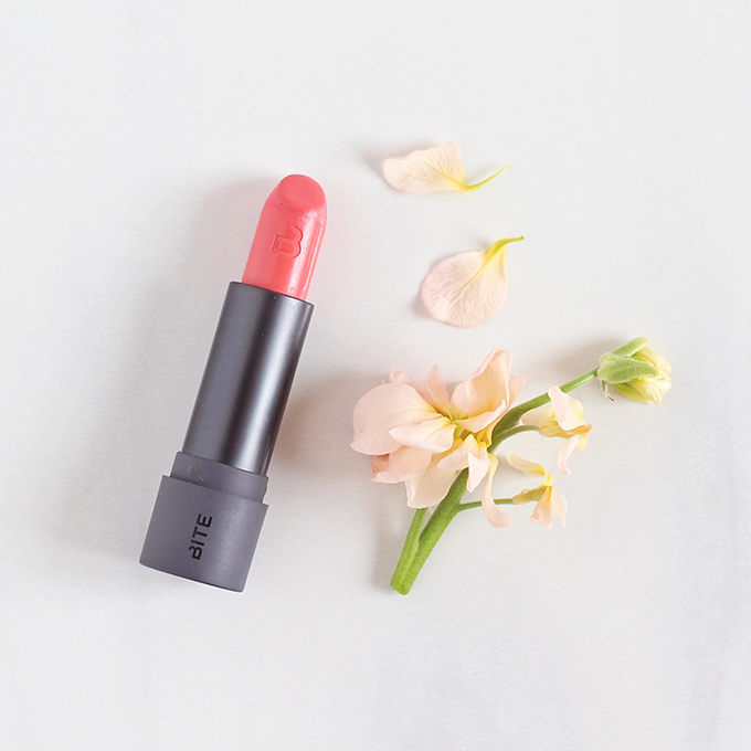
If you’re intrigued by Bite Beauty Amuse Bouche formula but Pickled Ginger is a bit too bold for your taste, try Gingersnap! It’s a mid-toned, neutral coral and a very accurate representation of Pantone’s Living Coral.
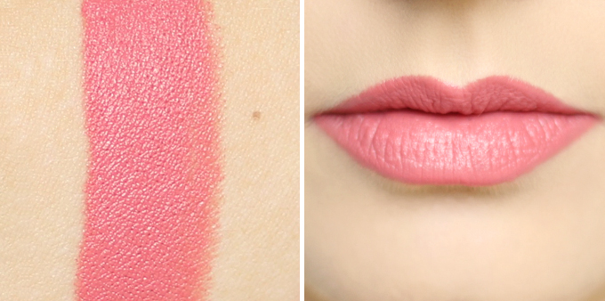 Gingersnap is a very wearable shade and it’s my favourite of the Amuse Bouche lipsticks I own — again, I think of it as a coral nude. It adds the perfect amount of colour to your completion without being overwhelming!
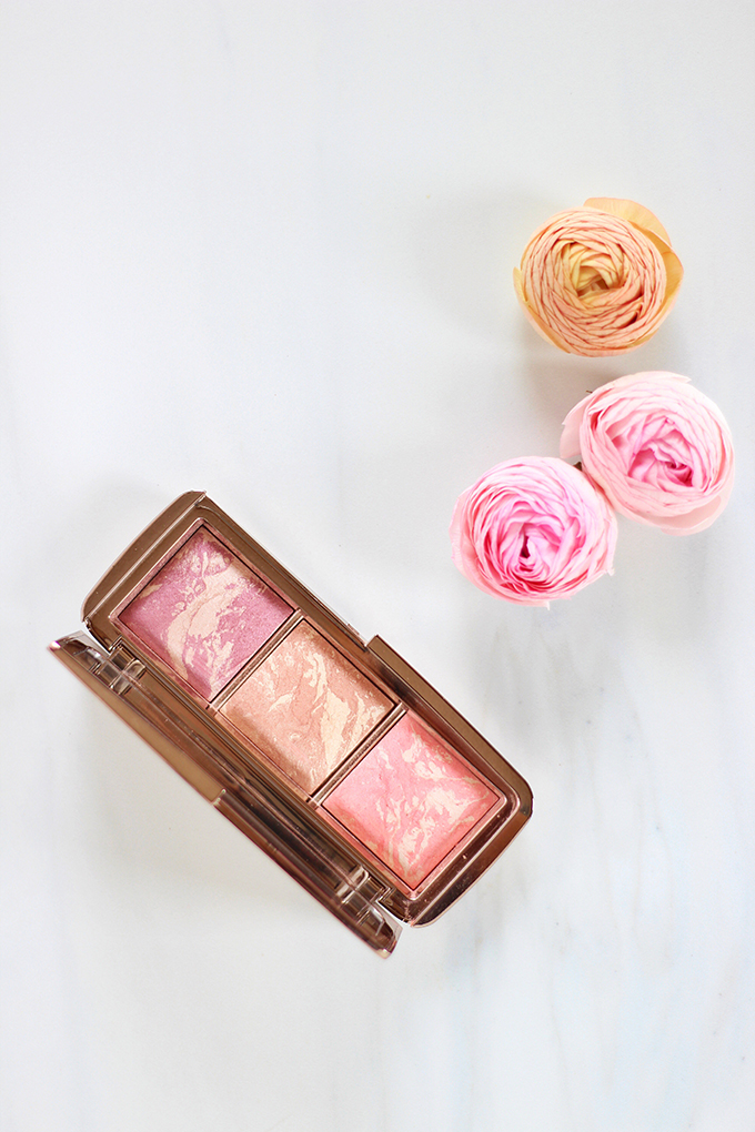
Let’s not forget about Pantone 2019 Colour of the Year inspired blush! Of all the shades of blush available, coral hues are my personal favourite to wear. I think they impart such a natural, warm flush — no matter the season!
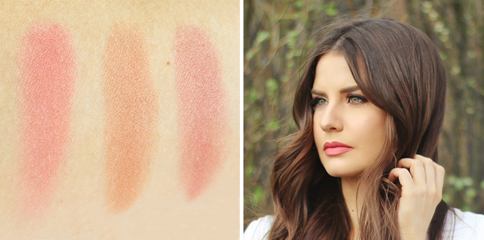
Hourglass’s Ambient Lighting Blushes are my all-time-favourite formula (proof!). Although the trio pictured above is no longer available, the bottom shade, Incandescent Electra, is sold separately in a full size — a beautiful, bold coral that imparts a serious glow. Coral crazed beauty lovers can also consider Diffused Heat for a subtle flush of 2019’s Colour of the Year!
LIVING CORAL FASHION INSPIRATION
When I started combing my wardrobe for Living Coral inspiration, at first nothing jumped out at me. Believe it or not, I don’t actually own any solid garments that are an obvious Living Coral shade — but I’ll definitely be on the lookout as we transition into spring!
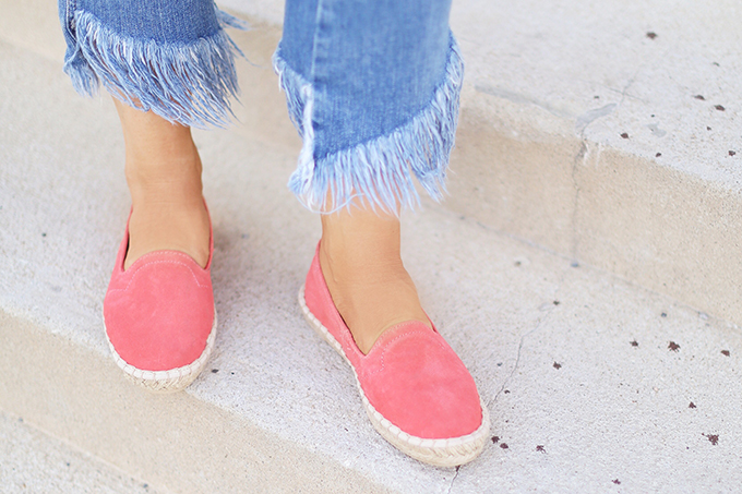
That said, I do have a handful of Living Coral hued accessories and prints — and that’s exactly the advice I’d give to give wanting to inject a hint of 2019’s hottest hue into their personal style! If you can’t commit to a bold, Living Coral hued garment, try it in a statement pair of shoes or a bag.
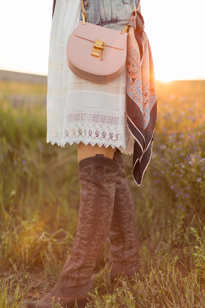
I love the subtle pops of Living Coral in my vintage scarf. Longtime readers will know I love to mix high, low, old, new and vintage no matter the occasion. This is a prime example of how you can look back at older pieces in your closet and incorporate them into your seasonal wardrobe through fresh, Pantone-inspired eyes!

These fun, hexagonal, coral-tinted shades are a favourite of mine for summer festivals and outdoor concerts. I actually wore this look to The Calgary Stampede last summer!
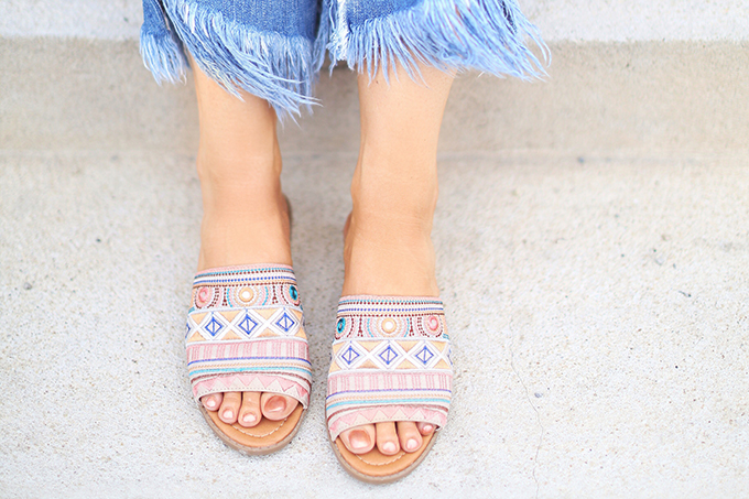 You can also look for accessories with Living Coral inspired hues in the pattern. I love these fun, bohemian slides with a kiss of coral. Somehow, they translate as fairly neutral even though they’re full of colour and I find them incredibly versatile!

This beautiful Hattie Tropical Floral Dress from 3rd Floor Studio (which I wore for my 3rd Blogiversary last year) is another example of how Living Coral can work in a print. I love the dreamy, watercolour effect of this unconventional floral pattern — it’s perfect for spring and summer special occasions!
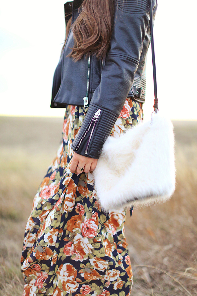
But wearing Living Coral inspired hues doesn’t have to be reserved for the summer months — or be overly sweet! Naturally, this shade lends itself well to floral print — like this moody maxi dress I love to pair with leather jackets during transitional months to give it some edge.
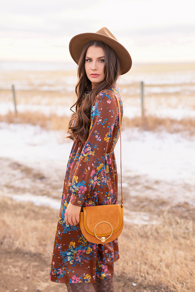
I wore this vintage-inspired floral midi dress in my Winter 2019 Lookbook. While I wouldn’t have normally thought to pair these items together during the winter, the colours in this dress, along with the Pantone Pantone’s Spring / Summer 2019 Colour Trend Report pushed me outside of my comfort zone.
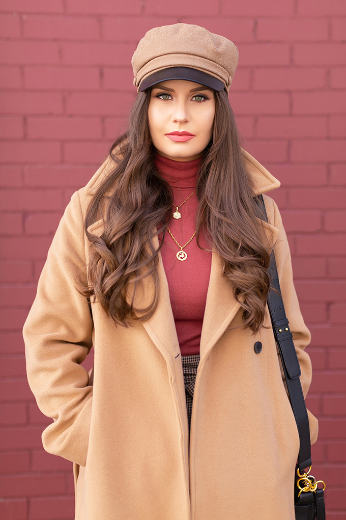
Living Coral also popped up in my Winter 2019 Lookbook in this gorgeous, super soft and snuggly turtleneck. Although it’s not an exact match for Living Coral, I like to think of this shade as a deeper, more winter appropriate version! When playing with colour trends, remember that they don’t have to be exact versions — they can be lighter, deeper, brighter or darker. Go with whatever shades and tints suits your personal style and colouring best!
LIVING CORAL FLOWER INSPIRATION
Naturally, Pantone’s 2019 Colour of the Year lends itself beautifully to florals. And in working with Rebecca Dawn Design to produce FLOWER content, we’ve seen some absolutely stunning instances of Living Coral blooms!
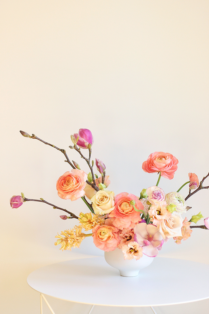
Probably my favourite instance of Living Coral hued flowers over the years was these stunning Japanese Ranunculus we worked with to create a blushing spring arrangement with an unconventional east-meets-west medley of blooms (these magnolia branches hail from Canada’s west coast!)
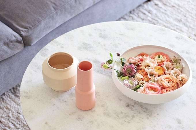
We also used those same blooms to create a DIY Floating Spring Centrepiece! This is such a simple idea with a big wow factor. If you’d like to try your hand at flower arranging but aren’t ready to jump into an arrangement, this is a wonderful place to begin! I also adore that Living Coral hued Posey Vase from EQ3 — they make the same vases every year in different colours and I always make a point of refreshing my collection each spring! They also work beautifully for small potted plants, which you’ll see below in the next section of this post.
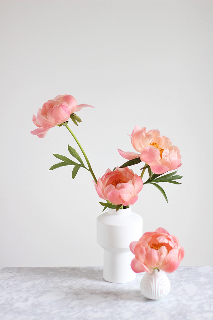
I can’t forget these showstopping Coral Sunset Peonies we worked with in our All About Peonies post. Without a doubt, these are my all-time-favourite flowers that have graced the pages of JustineCelina over the years. Flowers are a fantastic way to infuse any space with life and colour — and just a few stems added to a simple vase (or vases!) can be just as beautiful as the most intricate arrangement. When the blooms are this beautiful, sometimes simple is best!
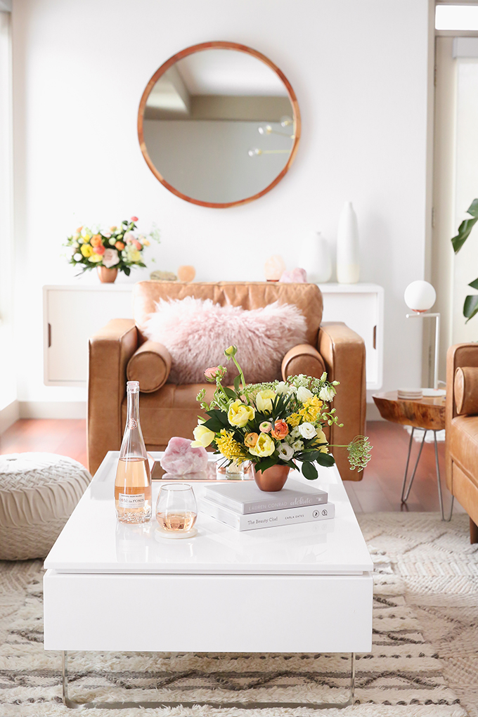
You’ll also find Living Coral Ranunculus (the regular variety!) in the arrangements Rebecca created for our Living Room Reveal. Coral really plays so well with almost any other colour and I love the way these cheerful arrangements unite the colours in our space.
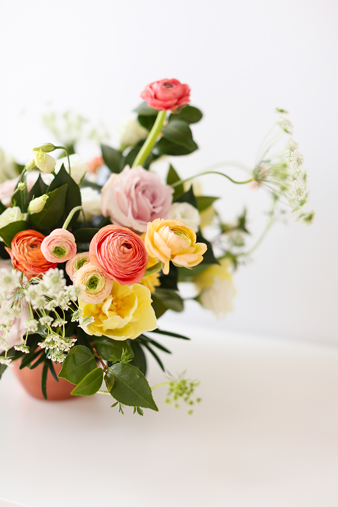
I absolutely adore this sweet, cheerful medley of blooms. Just looking at these photos conjures up feelings of spring! Although it was actually blizzarding outside last March on the day I shot these photos, it was definitely spring inside our apartment. Learn more about how you can use flowers to unite a room!
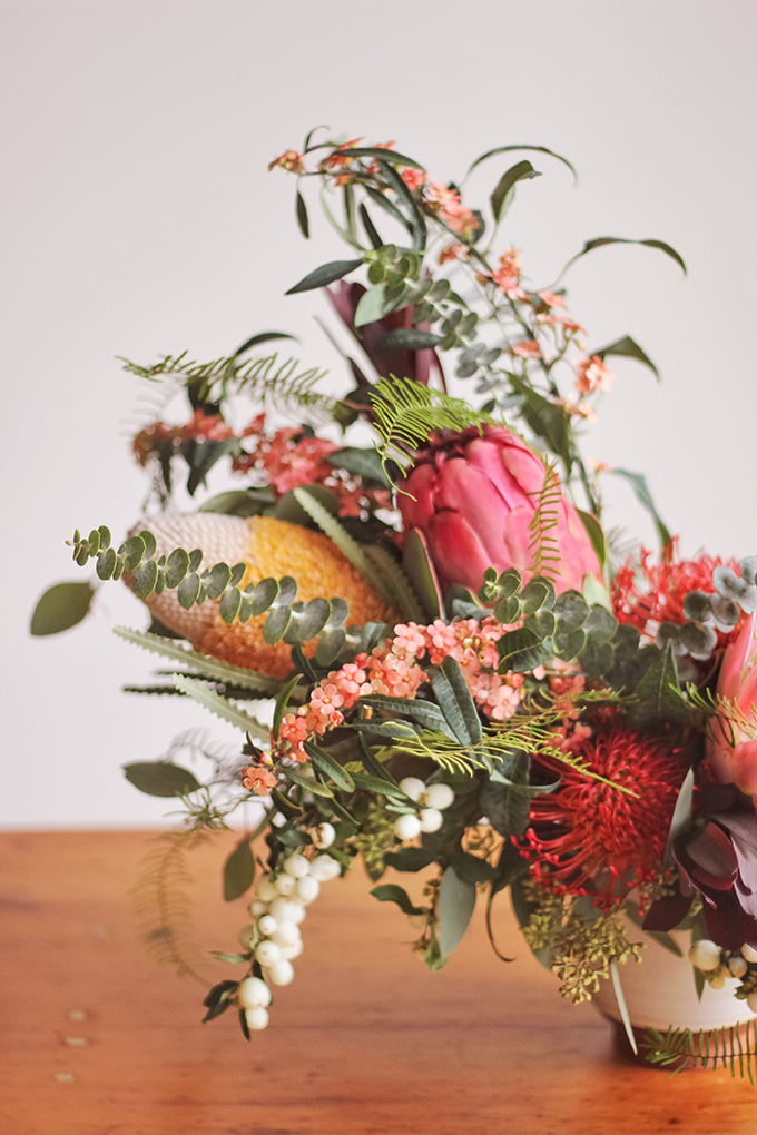 Living Coral hued blooms have always been present in the FLOWER content here at JustineCelina, no matter the season. Take this like this beautifully eclectic, globally inspired arrangement Rebecca created for our cozy girls night in 2 years ago!
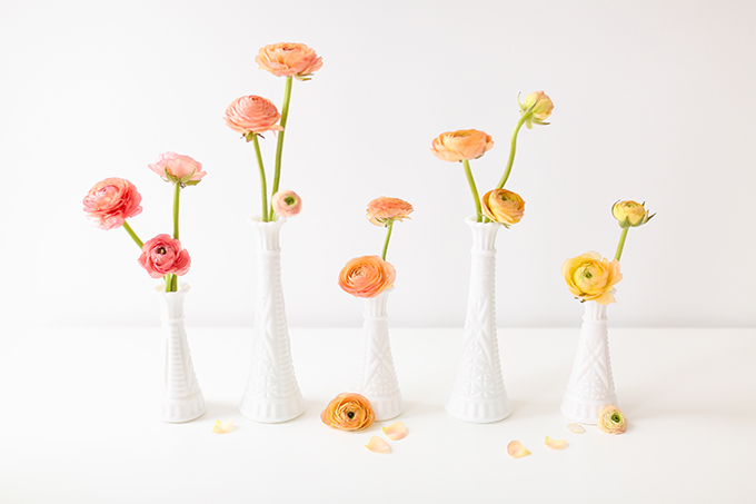 Living Coral hue abound in our All About Ranunculus post, which features a beautiful gradient of Pantone Colour of the Year 2019 hues. This is another example of how just a few blooms in vases can create a striking arrangement! All of the blooms used here are actually from the same bunch. Isn’t nature amazing?!
LIVING CORAL PLANT INSPIRATION
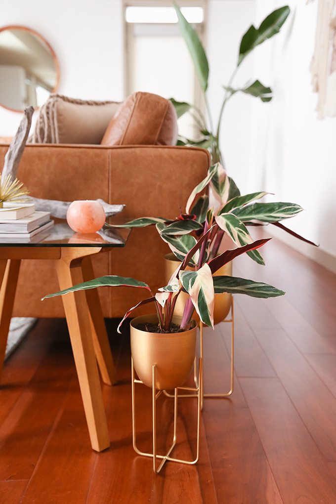 By now, you’ve realized my dedication to colour cohesion runs deep. So much so, that I also committed to incorporating pops of Living Coral into our plants! In the initial planning phase for our Living Room Space Refresh, I added Stromanthe Sanguinea to my moodboard. I was captivated by there unique, variegated leaves with pops of blush and coral and determined to track them down!
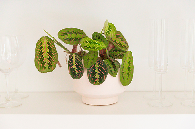 Along my journey of learning about plants, I also discovered Prayer Plants — a cousin of Stromanthe Sanguinea with striking, unique leaves. We have 2 varieties in our home, but this one is my favourite. Notice those pops of Living Coral in the leaves — and that soft coral EQ3 Posey Vase?!
LIVING CORAL FOOD & DRINK INSPIRATION
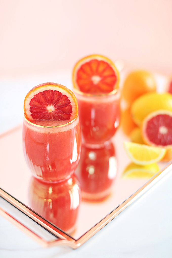
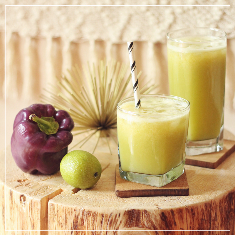
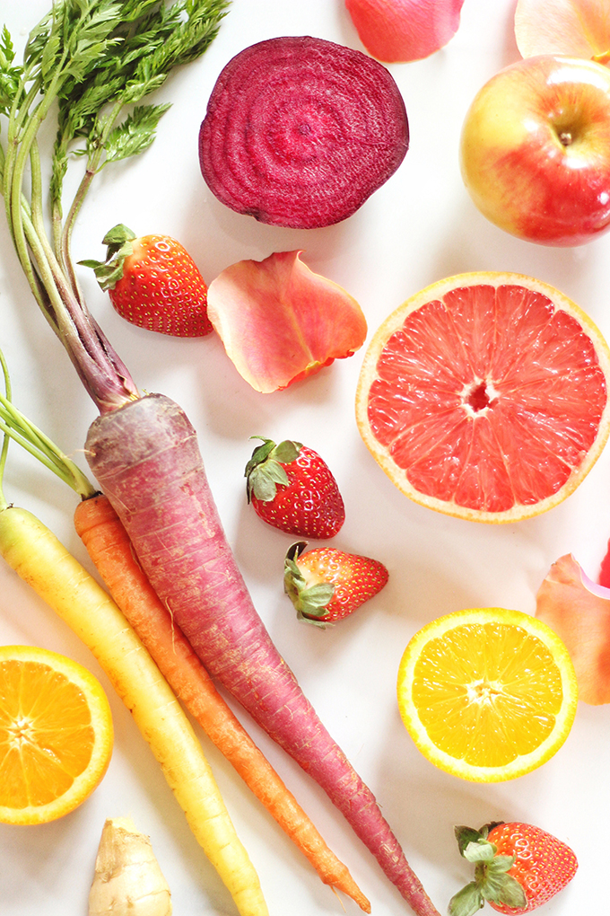 Of course, the 2019 Colour of the Year can also be found in food and drink! Probably my favourite instance is naturally occurring in grapefruit. Longtime readers will know I love my fresh juices here at JustineCelina — my Blushing Beet Juice (above) and Citrus Season Elixir (below) feature grapefruit and a vibrant pink or coral hue.
 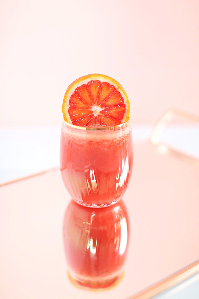 I also shot my Citrus Season Elixir against that custom Living Coral inspired backdrop I painted last year!
LIVING CORAL ENTERTAINING INSPIRATION
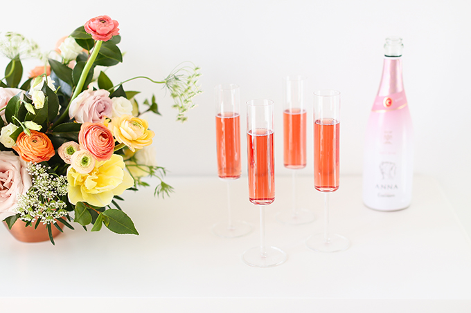 If you love to ENTERTAIN, or simply love rosé (or both!), I have fantastic news — rosé from almost every region qualifies as Pantone Living Coral adjacent!
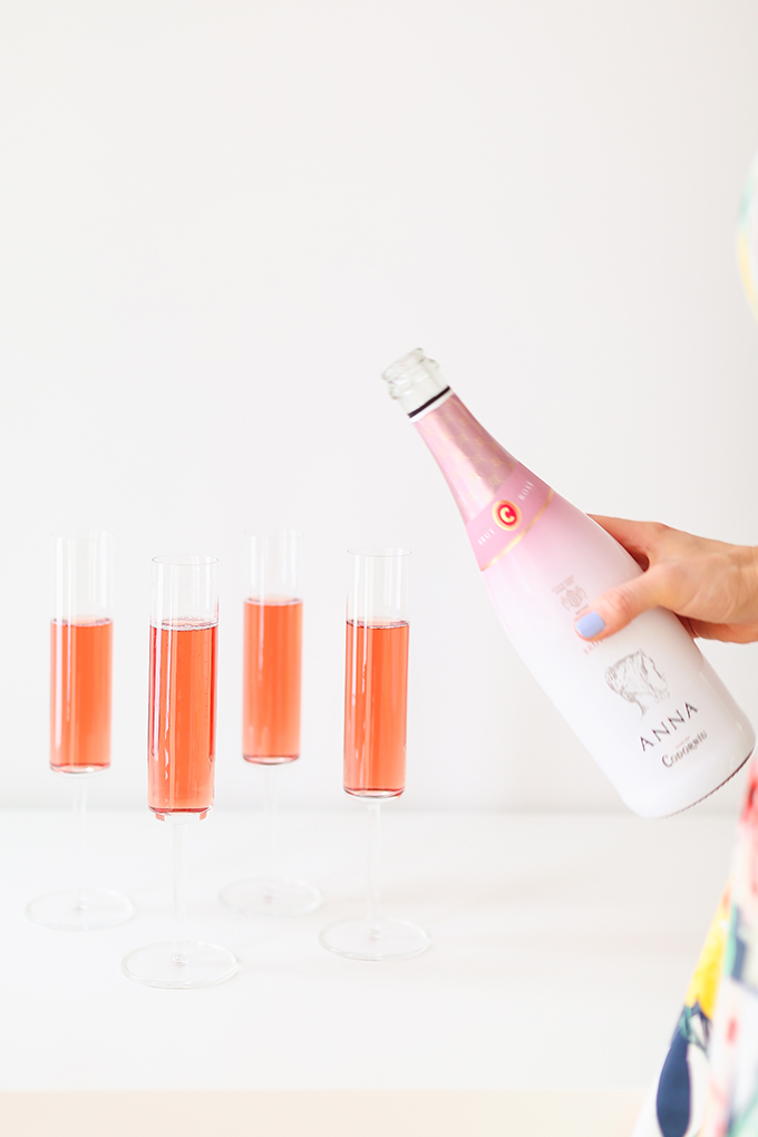
This Codorníu Anna Brut Rosé is one of my favourite dry, sparkling rose wines. Plus, it’s absolutely gorgeous! Add an on-trend spin to your entertaining menu this year with a bottle of Living Coral inspired bubbly.
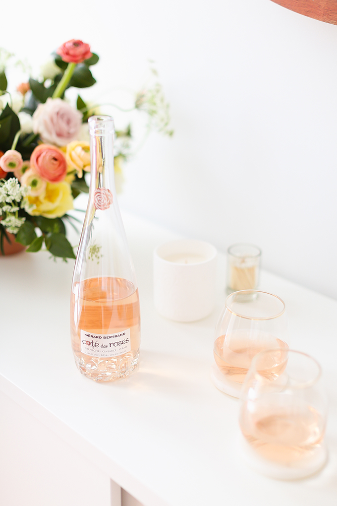
Although a softer shade of Living Coral, another one of my favourite Provence-style rosé wines is Gérard Bertrand’s Côte des Roses. Not only is it extremely delicious, the bottle was designed by an art student and features a rose-inspired base.
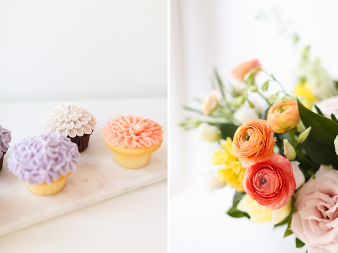
If you’re hosting any type of party, consider adding Living Coral inspired sweets to your celebration! This shade lends itself particularly well to icing — as demonstrated by these lovely Pantone 2019 Colour of the Year cupcakes Crave Cupcakes created for my 3rd Blogiversary.
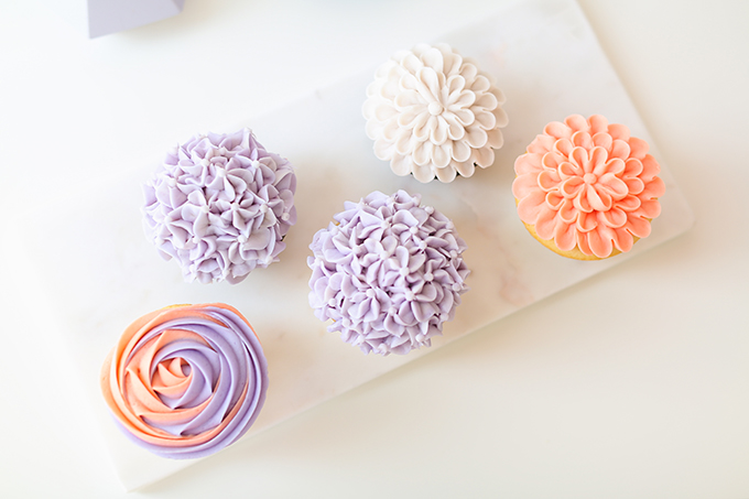
If you’re Calgarian, the ladies at Crave are masters at colour matching if you’re looking for something specific. Over the years they’re been able to match specific Pantone swatches for various occasions and I’m always delighted with the finished product.
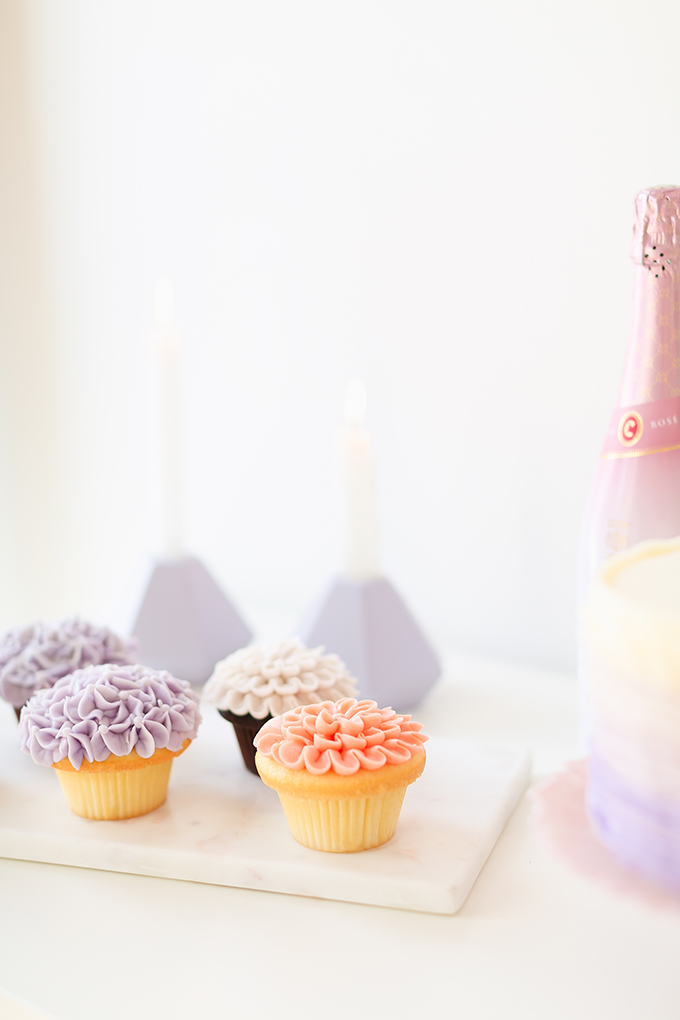
Their floral cupcakes are absolutely beautiful — and they also offer gluten free options! I truly can’t recommend this local business enough. Browse the sweets they’ve created for JustineCelina over the years here!
MORE PANTONE INSPIRED CONTENT
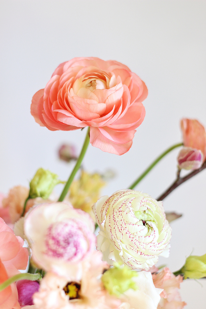
A Pantone 2018 Ultra Violet Inspired Arrangement
Pantone 2016 Colour of the Year Inspiration | Rose Quartz & Serenity
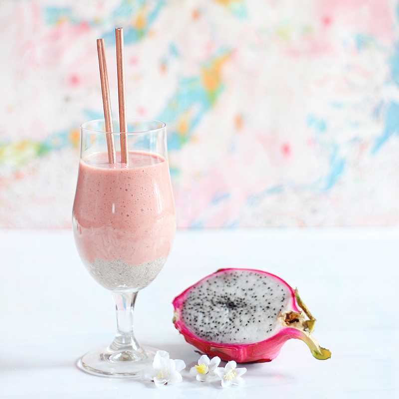
Pantone Inspired Banana Walnut Green Smoothie Bowl
I also have a massive PANTONE section here at JustineCelina featuring every post’s colour palette that has been inspired by Pantone!
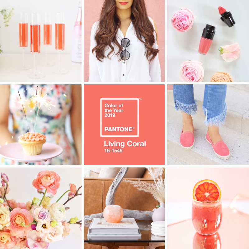
PIN MY PANTONE 2018 COLOUR OF THE YEAR INSPIRATION GRAPHIC FOR EASY REFERENCE!
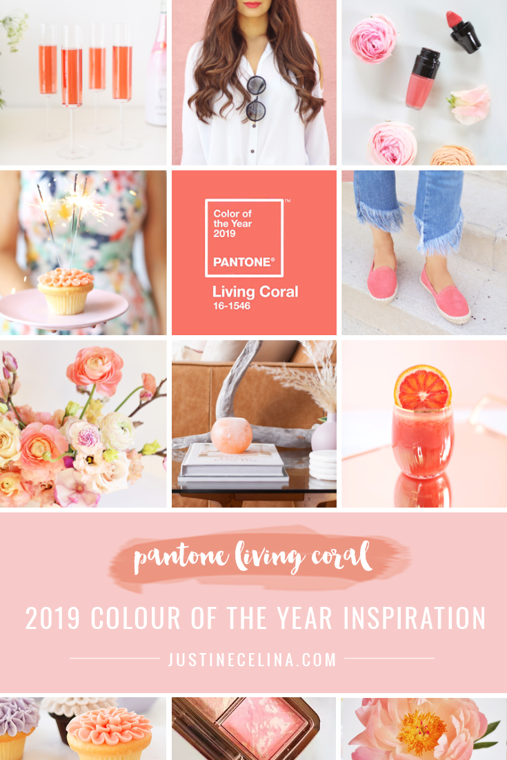
I hope this roundup of Living Coral content has inspired you to incorporate Pantone’s Colour of the Year for 2019 into your world this year! What are your thoughts on Pantone’s selection? I think the general consensus is that most love it — but I’d love to know your thoughts. As always, I look forward to allowing Pantone’s selections to inspire, challenge and shape my work each year. You can expect a whole lot more Living Coral themed content coming your way here at JustineCelina this year — and I would absolutely love to find a statement piece of clothing in this stunning shade.
In the meantime, if you’re craving even more Living Coral inspiration, follow along with my Pinterest board, where I’ll continue to collect Pantone 2019 Colour of the Year themed images! As always, thank you for stopping by today friends. I hope I brought some colour to your world on this chilly winter day!
Disclaimer: PANTONE branded images images courtesy of pantone.com. Some items featured in this space were provided by HomeSense, Eau Claire Distillery, Sephora Canada and 3rd Floor Studio as part of previous partnerships. This post is not sponsored and contains my genuine thoughts, ideas and recommendations. JustineCelina uses affiliate and referral links, which allow me to receive a small commission when you make a purchase through one of my links. Thank you for supporting the brands and businesses that support JustineCelina!
8 Comments
Hi,
I stumbled upon your blog and I’m glad I did because I like it a lot 🙂
The colors, the outfits, the whole aesthetic is very nice and beautiful, I guess you have a new follower!
xo
D.
I’m so happy you’re here, Denise! Thank you for the kind comment — you made my weekend.
[…] I’ve scoured the internet to curate a selection of my favourite chain printed pieces (wow, that’s a tongue twister!), but dresses and skirts with some movement are my favourite ways to wear it as temperatures start to rise. If you’d prefer a less feminine option, there are also some beautiful chain printed shirts, tunics and scarves hitting retailers in dreamy, spring-inspired palettes (I have my eye on this one from Mango that incorporates a touch of Pantone’s 2019 Colour of the Year, Living Coral!). […]
[…] and the formula is ultra luxurious and hydrating. If you’re looking to dip your toes into the Living Coral trend, this beautiful, classic lipstick in a universally flattering shade is a great place to […]
[…] from the Pantone Spring / Summer 2019 Fashion Colour Trend Report — including Living Coral (2019’s Colour of the Year), Mango Mojito and Princess Blue. I loved the mixture of earthtoned brown juxtaposed with bright, […]
[…] bold colours, patterns or pastels that compliment your colouring and personal style! I’ve mentioned this previously, but in art college we learned that coral is the most universally flattering colour — meaning […]
[…] Lisianthus (hailing from British Columbia) along with whimsical Waxflowers — set on a Pantone 2019 Colour of the Year inspired backdrop. If you’re ready to deck your tech out in some major summer vibes, […]
[…] usual, this look is a mixture of high, low, old and new (these Pantone Living Coral inspired pants have been with me for about 6 years!). I love looking to seasonal colour trends to […]