Welcome back for the next highly anticipated reveal in our SPACE REFRESH series, friends! This project has been a year in the making — and today, in partnership with Mobilia Canada, I’m elated to bring you our refreshed Entrance Way! By far, this has been the most challenging room in our SPACE REFRESH series to date. Although it’s responsible for the first impression upon opening the door to our home, it was anything but welcoming before we embarked on this journey back in November of 2018. In stark contrast to the expansive, airy, natural-light-filled rooms you’re used to seeing on these pages, our Entrance Way was exactly the opposite — dark and choppy with just a speck of natural light (just wait until you see the BEFORE photos!). In fact, when we first viewed this apartment before purchasing it 7 years ago, I nearly turned around and walked out — but I’m so glad I didn’t!
You see, all those bright, south-facing, beautifully lit living areas, bedrooms and offices were just past the dimly lit Entrance Way, down a couple of long hallways — which is typical of apartment floor plans. Despite its shortcomings, I was determined we could achieve the welcoming first impression I’d always dreamt of by transforming this space into a bright, welcoming, functional room that felt cohesive with the rest of the apartment. Our Space Refresh | Entrance Way Reveal is a complete overhaul — from a fresh coat of paint, to new light fixtures, to gorgeous new furniture (generously provided by Mobilia), to decor and even a few DIYs! If you have an awkward, uninspiring room in your home in desperate need of a makeover and are searching for some fresh ideas, you’ve come to the right place! Today I’m detailing the entire design process from mood boarding to paint and furniture selection, sprinkled with all my best small-space, storage maximizing tips. So although you may already be familiar with our home, I’d like to formally welcome to our bohemian-meets-mid-century, inner city apartment — may I take your coat?
SPACE REFRESH | ENTRANCE WAY REVEAL
You know those rooms you put off because you’re either intimidated or uninspired? We all have them — and for me, that was our Entrance Way.
We began our SPACE REFRESH series two years ago with the plan to turn our inner city Calgary apartment into our dream home after deciding we wanted to stay rather than sell — starting with a fresh coat of paint. The walls were a heinous, gloomy builders greige, which made our already choppy, dimly lit Entrance Way even darker and colder. When I look back at the BEFORE photos, I can hardly believe it’s the same space!
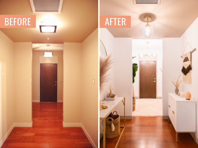
So although we began refreshing our home in 2017, I chose to tackle our Living Room and Dining Room / Bar first as they’re the rooms we spend the most time in. The four coats of Behr’s Ultra Pure White required to transform our walls from greige to white (yes, really!) did wonders in brightening up the apartment, but the main living areas are also airy and expansive by nature — thanks to an open floor plan, nine foot ceilings and the wall of south-facing floor to ceiling windows. Our Entrance Way has none of those things going for it, except for high ceilings in the first room!
Our builder’s concept behind the unique layout of this corridor was to have two separate ‘rooms’ upon entrance, before making your way to the heart of the apartment (see a sliver of our Bar at the end of that very long hallway?). The first ‘room’ is where we’ve always put on our shoes, hung our coats (there’s actually a large walk-in closet behind the door on the left) and checked our reflections before running out the door. The second ‘room’ was home our console table and round mirror — a place to put our keys and store other belongings (with the Main Bathroom behind the door on the left and Laundry Room behind the double doors in front).
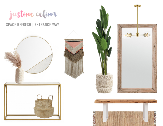
The way we used the space worked for us, but we needed to upgrade our furniture with pieces that were appropriate for the scale of the space, while offering more concealed storage. It was important to me to treat this space like any other room in our home, investing in quality furniture made from durable, natural materials that will stand the test of time. I knew I could make use of the deceiving amount of space and unique layout to bring in pieces that would meet our needs, while also creating a warm and inviting room!
That said, I searched tirelessly for pieces for our Entrance Way as I designed the other rooms in our home — and nothing really caught my eye. But as luck would have it, Mobilia Canada (who I was familiar with through friends in the design industry), invited me to the launch of Calgary-based interior designer Aly Velji‘s Modern India Collection (who came along on Stories?). I was completely blow away by the collection, as well care the care and craftsmanship that went into each piece.
After meeting the people behind this small, family run company from eastern Canada and chatting with Aly about the inspiration behind Modern India, I knew Mobilia would align perfectly with my vision for the Entrance Way. As I’ve mentioned previously, our builder was inspired by earth’s natural elements and I’ve channeled that same inspiration into every room in our home — choosing furniture and decor made from wool, cotton, leather, wood, marble and iron to create cohesion and unity. I was able to find furniture made from all my favourite materials to refresh this challenging space at Mobilia — and today I’m excited to share how it all came together!
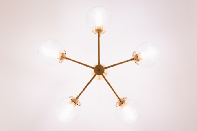
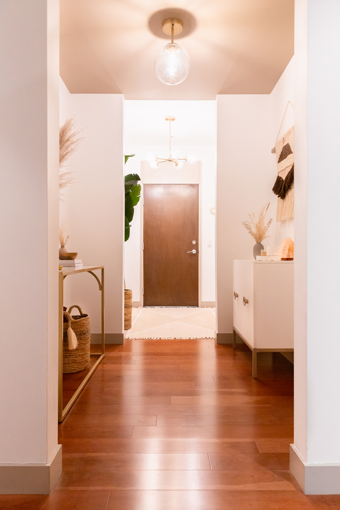
When refreshing any space, I like to start with a fresh coat of paint (this is Behr’s Ultra Pure White), followed by new fixtures. To keep things cohesive, I opted to swap the original light fixtures for two new pieces inspired by our Dining Room chandelier to create a bright, open feeling. I selected the Daily 5 Light Sputnik Sphere Chandelier in the first room for a bit of drama (and to highlight to the high ceiling), while the complimentary Cournoyer Light Single Globe Pendant works perfectly in the second room to accommodate the lower ceiling.
After paint and fixtures were taken care of, I got to work choosing our new Mobilia furniture. Promptly after placing our order, our items were delivered complete with their signature White Glove Delivery Service, within the three hour window I specified. Each piece of furniture was carefully unpacked and assembled in our hallway (to keep the mess out of the apartment!), before being placed exactly where I wanted it. Starting at $99, Mobilia’s White Glove Delivery Service is available across Canada — and it’s is a must for those looking for ultimate convenience!
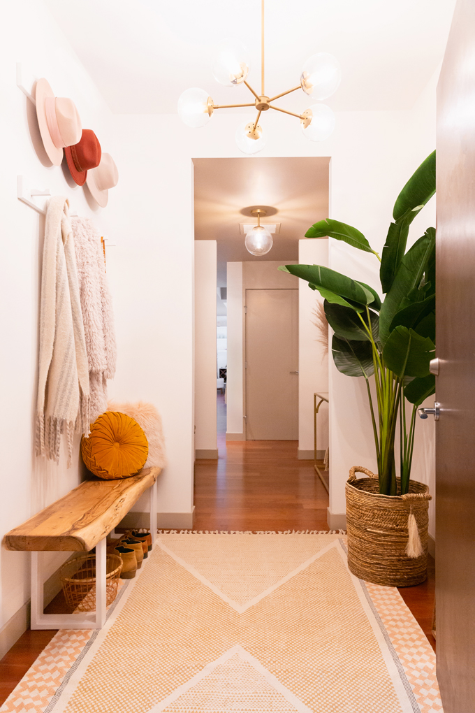
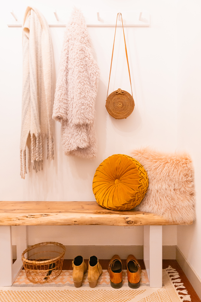
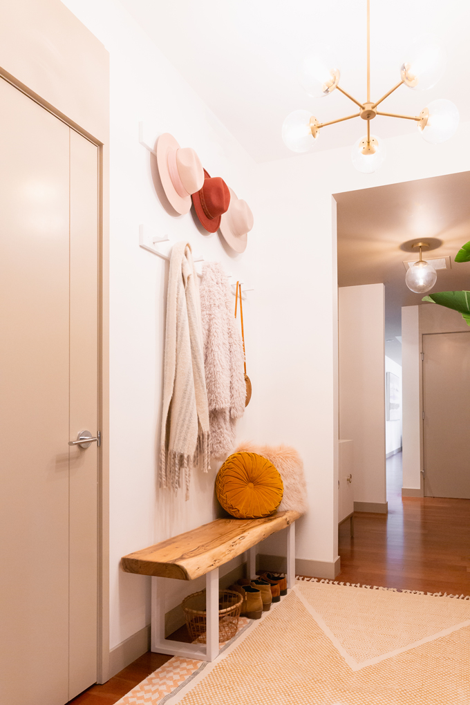
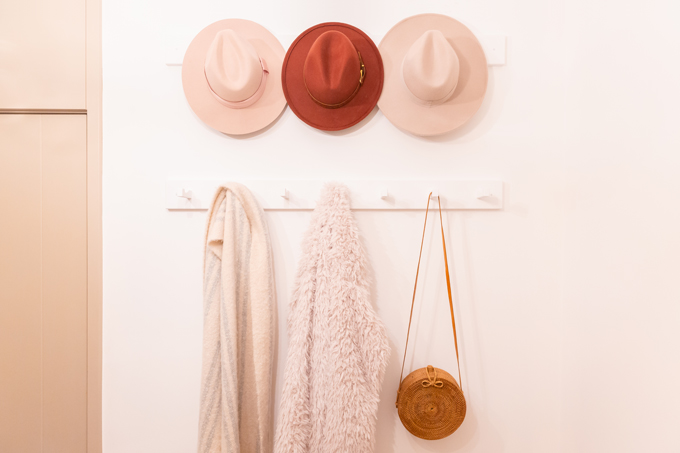
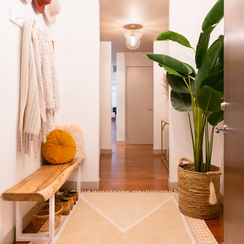
Beginning with the first room, the Jura Wood Bench in Light Brown provides a convenient place to put shoes on without overwhelming the space. I love the raw, live edge acacia wood (our dining table is also made from acacia) contrasted by a sleek, cast iron base — and added a couple of throw pillows in luxurious Mongolian lamb and velvet to create a cozy, welcoming ambiance this autumn. To make use of the space above the bench (this room has nine foot ceilings!), I installed two custom hook racks, creating for extra storage for us and our guests to hang coats, bags, hats and scarves. I also sourced an ultra durable 100% machine washable rug (a necessity here in Calgary!) and decorative pillows to bring some pattern and colour to our Entrance Way.
I knew a large floor mirror across from the bench would really open up the space — so I selected Mobilia’s India Wall Mirror in keeping with the natural wood theme. Unfortunately it’s no longer in stock, but you could achieve a similar look with Indira or Nata — both of which are standing wooden wall mirrors with similar dimensions.
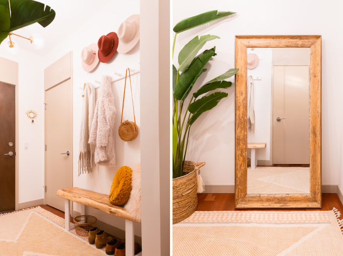
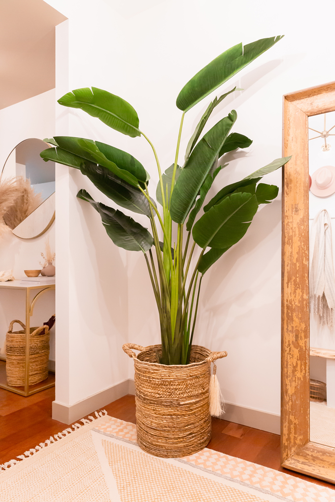
Many of you are likely familiar with Barry (our beloved mature Bird of Paradise!) that resides in the Living Room. I may be turning into a crazy plant lady, but to me a room just doesn’t feel complete without some type of greenery — which posed a problem in our natural light-less Entrance Way! I had never considered artificial plants prior to being introduced to Mobilia’s Saika Artificial Plant at their event (doesn’t it look real?!). Saika adds that fresh, organic touch to our Entrance Way I was craving, plus it’s ideal for this very low light room where living plants wouldn’t flourish.
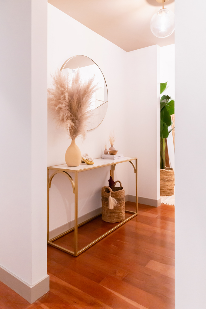
In the second room, I selected the complimentary Satya Marble Console Table and Surya Wall Mirror to create a polished vignette on the right wall. Both pieces are part of Mobilia’s Modern India Collection and I adore their stunning, exotic simplicity. Inspired by classic Indian architecture (as a nod to Velji‘s heritage) and carved from genuine Banswara white marble encased in brass finish iron, we’ll treasure these classic pieces for years to come.
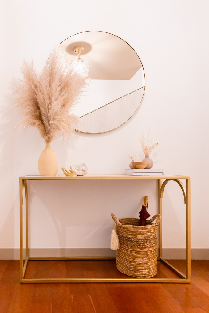
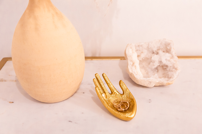
To allow these iconic pieces of Calgary interior design history to punctuate the room, I kept the styling monochromatic and minimal. A series of low-maintenance pampas grass arrangements, a quartz geode from our travels, an Indian-inspired ring dish, a pair of coffee table books, a wooden bowl to stash keys and a woven basket to house umbrellas create a space that’s as functional as it is beautiful.
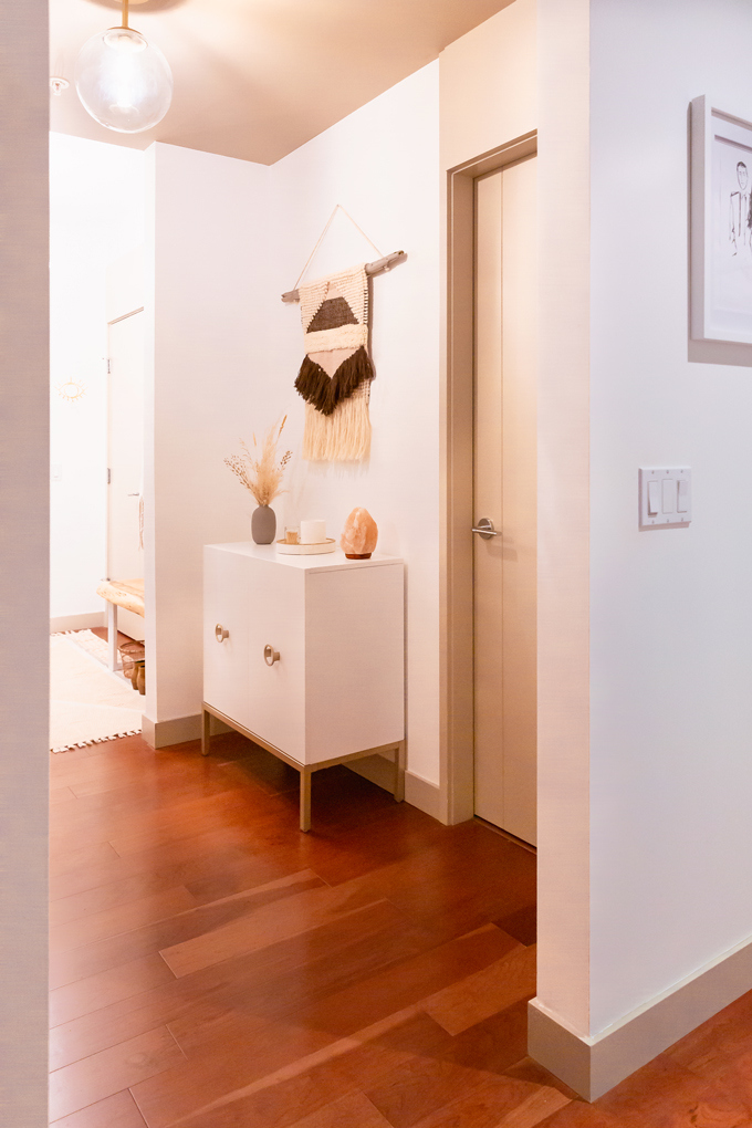
On the adjacent wall I found the concealed storage I was looking for in a sleek metal base accent cabinet (containing my sunglass collection, among other things!) contrasted by a DIY Driftwood Macrame Wall Hanging, created with wood foraged from Alberta’s Barrier Lake. I styled this area with familiar touches at play in the rest of our home — including a dried arrangement, marble tray (creating cohesion with the marble pieces on the opposite wall), slow-burning candle and purifying Himalayan salt lamp.
Although our Entrance Way took much longer that I originally anticipated, we couldn’t be happier with the finished space. It’s a room that we absolutely love coming home to — a welcoming, tranquil oasis ready to greet us after a long day! I truly believe that with hard work, a little imagination and an uncompromising vision, you can transform even the most uninspiring spaces into beautiful, functional rooms that leave a lasting impression.
SHOP OUR ENTRANCE WAY
MORE FROM OUR SPACE REFRESH SERIES
Space Refresh | Paint Transformation
Space Refresh | Living Room Reveal
Space Refresh | Dining Room, Bar and Kitchen Reveal
Our Dining Room Bar | A Built-In Look on a Budget
 Thanks for stopping by for our Entrance Way Reveal today, friends! I hope you enjoyed learning more about how I transformed the most challenging rooms in our apartment into a welcoming and functional space — and that it’s inspired you to tackle a challenging project in your own home. What was your favourite part of this transformation?
Curious about what’s next in our SPACE REFRESH series? Our Main Bathroom Reveal will be hitting the blog next month and I’ll also be working to finish up our Hallways. I’m aiming to have every room we’ve painted completely finished by the end of the year, so we can start with a fresh coat of paint and complete overhauls of the Master Bedroom, Master Bathroom, Walk-In Wardrobe and Office in 2020! But if you’re looking for even more home based content in the meantime, you can also follow along with my Home Pinterest Board for more interior inspiration, or the JustineCelina Home board where I’ll be pinning our refreshed spaces and other DWELL content as it rolls out. Enjoy this stunning autumn day, everyone!
Disclaimer: Thank you to Mobilia Canada for furnishing our Entrance Way. This post is not sponsored and contains my genuine thoughts, ideas and recommendations. Thank you for supporting the brands and businesses that support JustineCelina!



17 Comments
Love this, Justine!! So bright and fresh, yet invitingly cozy! 🙂 I love the two little lilac-taupe vases with the wheat (on top of the books) and the wooden bowl. Are those from EQ3?
Thank you so much, Nahya! That’s exactly what we were going for and I’m so happy it comes across. 🙂
The items you’re curious about are unfortunately out of stock, but I’ll shoot you an email with alternate sources. Have a great day!
[…] very happy with the way things are coming together. Originally I was planning to have both the Entrance Way and Main Bathroom complete by the end of Q2, but due to a couple of furniture items being back […]
[…] Living Room update to finish up our Entrance Way (this next instalment in our SPACE REFRESH series is now live!) — and this is where we’ve ended up. But rather than waiting to publish our Fall […]
[…] to share the next rooms in our SPACE REFRESH series with you over the coming months — both the Entrance Way and Main Bathroom are nearly complete! They’ve come together organically over time and I’ve […]
Love the transformation! All the pieces look so great together. Well done!
Thank you very much, Rasha! Mobilia has such beautiful pieces I had a hard time choosing — but I’m very happy with our final selections.
This all came together SO nicely! Well done!
Thanks Jennifer, we’re so happy with it too! It feels great to have such a challenging project under my belt — I’m feeling inspired to tackle the next rooms.
[…] Soundtrack here at JustineCelina! October was full of lots of BTS work fall content (including our Entrance Way Reveal!) — and these ultra chill, jazzy tunes are what kept me going. My October 2019 Soundtrack is […]
I love your blog. Beautifully done. I can’t quite tell what colors you chose for the walls and ceiling?
Hi Kelsey! Thank you so much and welcome, it’s always nice to see a fresh face around here. I actually have a post all about our Paint Transformation detailing everything you’ve just inquired about. I hope you find it helpful — but if you have any additional questions, just ask!
[…] to add an organic touch to areas that don’t get enough natural light for plants (like our Entrance Way and Main Bathroom — which is next up in our SPACE REFRESH […]
[…] for my first dedicated DWELL post of 2020 — in fact, it’s been almost a year since my last! So what exactly have I been up to around here? Well, to be completely transparent, all the brand […]
[…] me. Over the years, I’ve integrated many evil eye themed pieces into both my wardrobe and my home — believed by ancient cultures to offer protection to the wearer and guard against […]
Would you mind sharing where the 2 pendant light fixtures came from?
Hi Cole! It’s my pleasure. I’ve just updated the post with shoppable links to lighting and decor sources where possible. One of the fixtures is currently 50% off, too! Please let me know if you have any additional questions and have a great day!